Playful mobile UI: a big count-up number on a gauge arc (19 → 19,538 steps), 3D glossy mascot blobs with dot eyes as the AI "face", emoji streak row, one heavy bold headline with a muted second half ("Hey There! What's On Your Mind Today"). Delight comes from one animated hero element per screen on an otherwise plain white/black/lavender layout; a fit for WannaChat's character and streak screens.
2026-11-11 · 2026-11-11-heysatya_-kree8-playful-app-screens.md
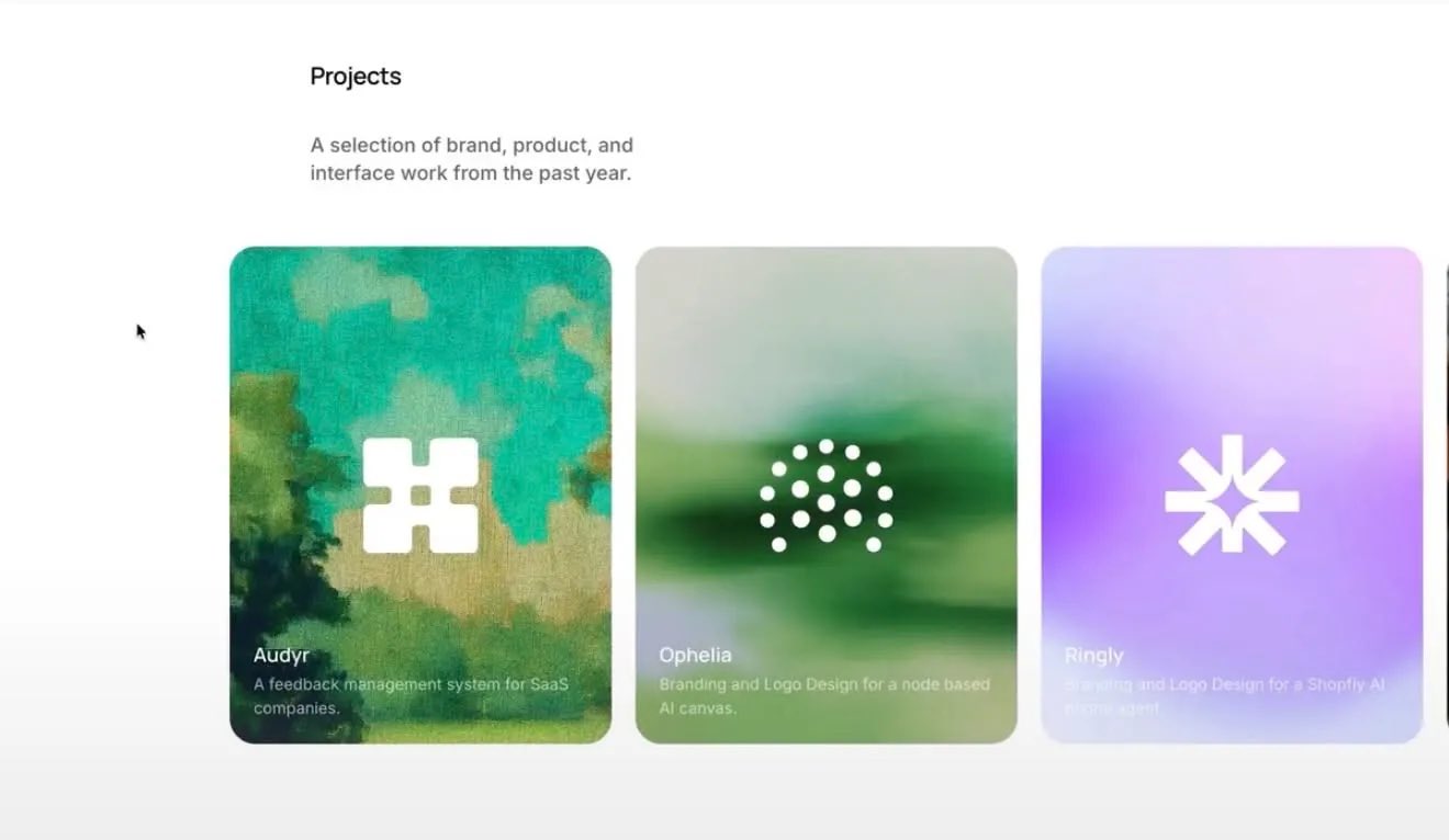
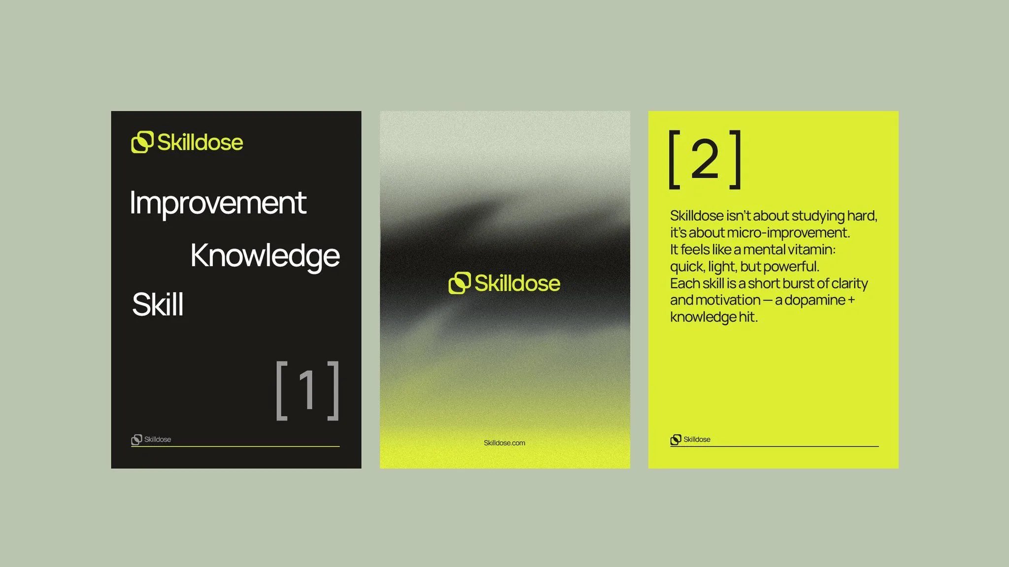
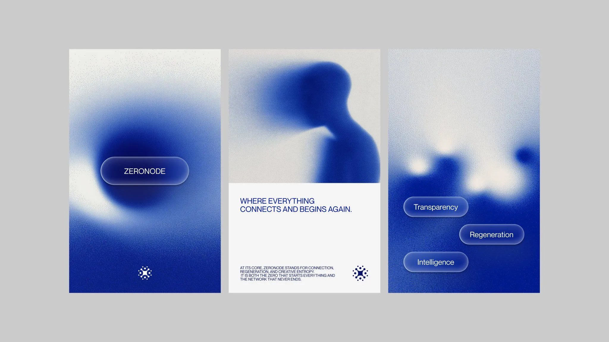
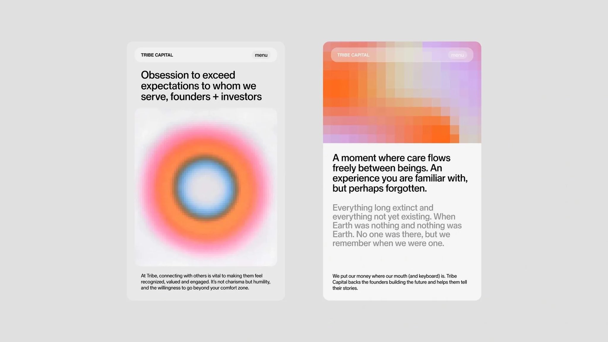
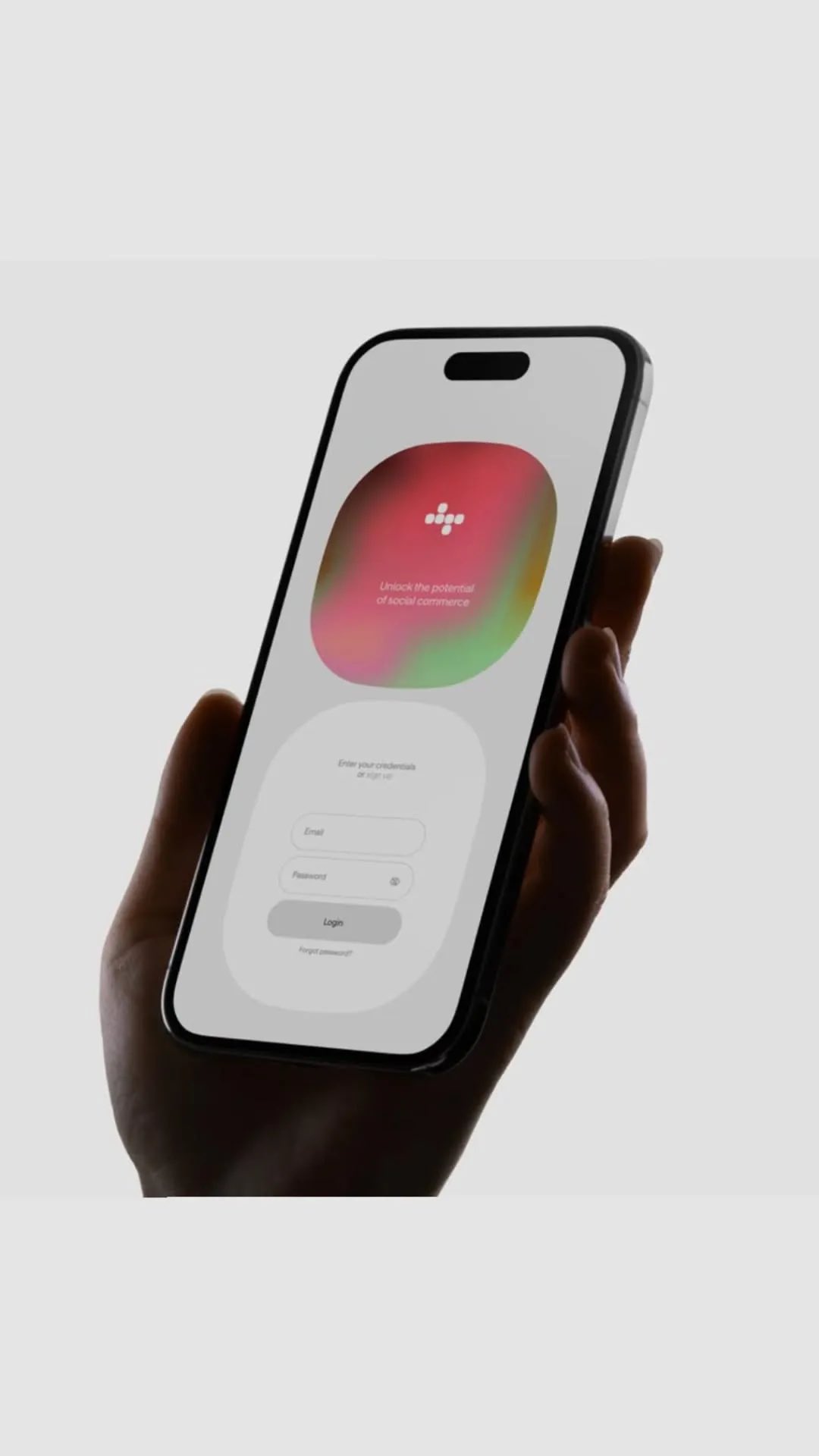
Four card/poster sets built on one trick: a blurred, grainy gradient (or painterly/pixelated image) fills the card, with one flat white logo or a few glass pill labels on top and small plain sans text. It works because each set holds to one hue plus neutrals, uses heavy film grain so the blur feels physical, and keeps generous rounded corners and empty space. A reference for WannaChat cards or a marketing hero; same "aura" family as 2026-11-08-x6sense-aura-green-ui-moodboard.md.
2026-11-10 · 2026-11-10-x6sense-grainy-gradient-cards.md · +3 media
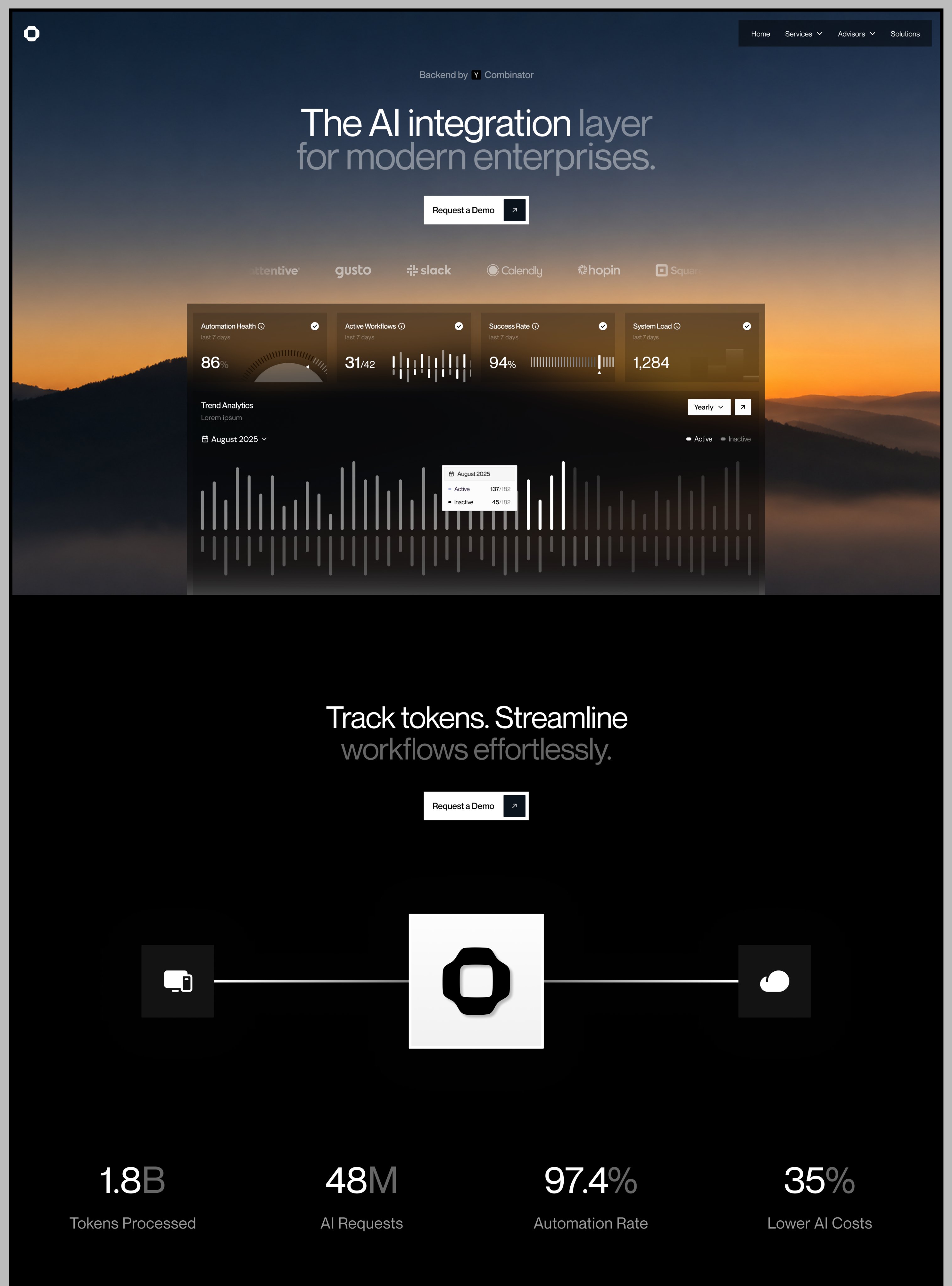
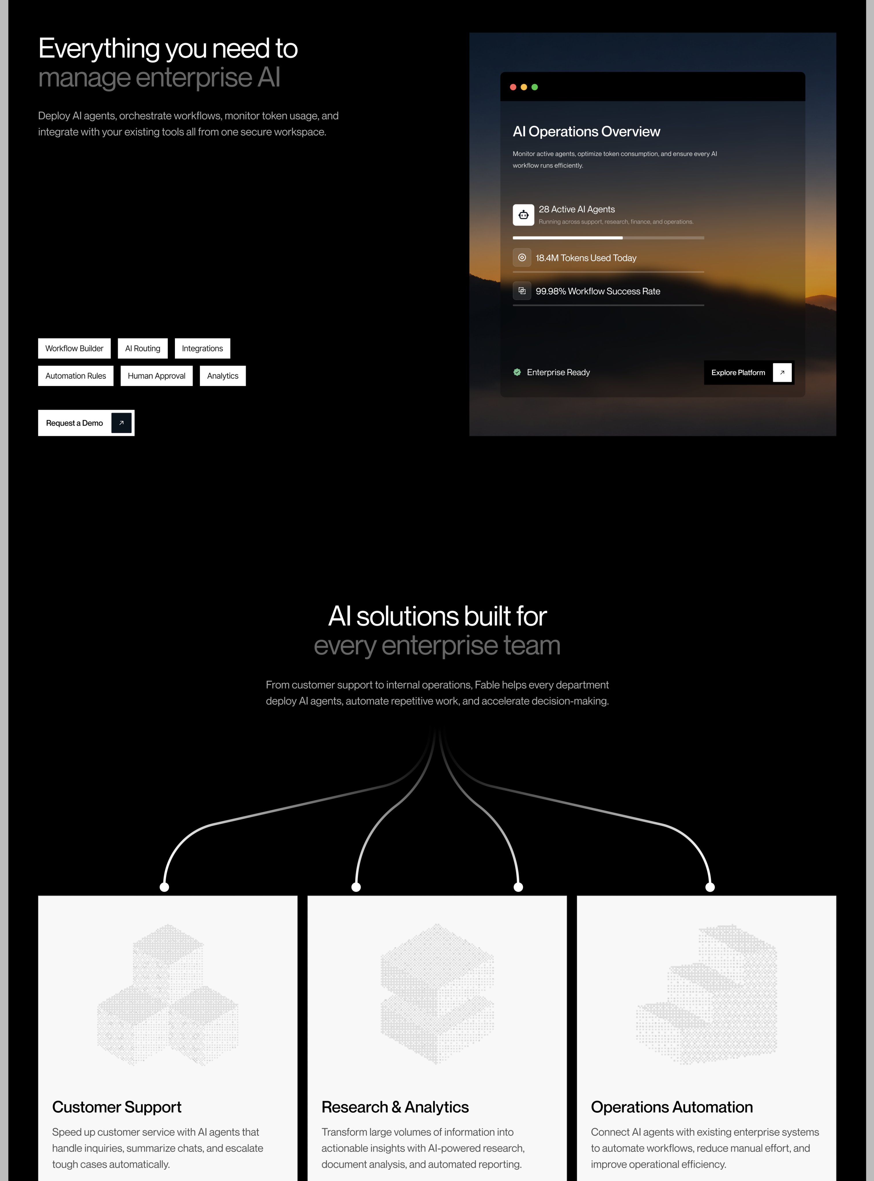
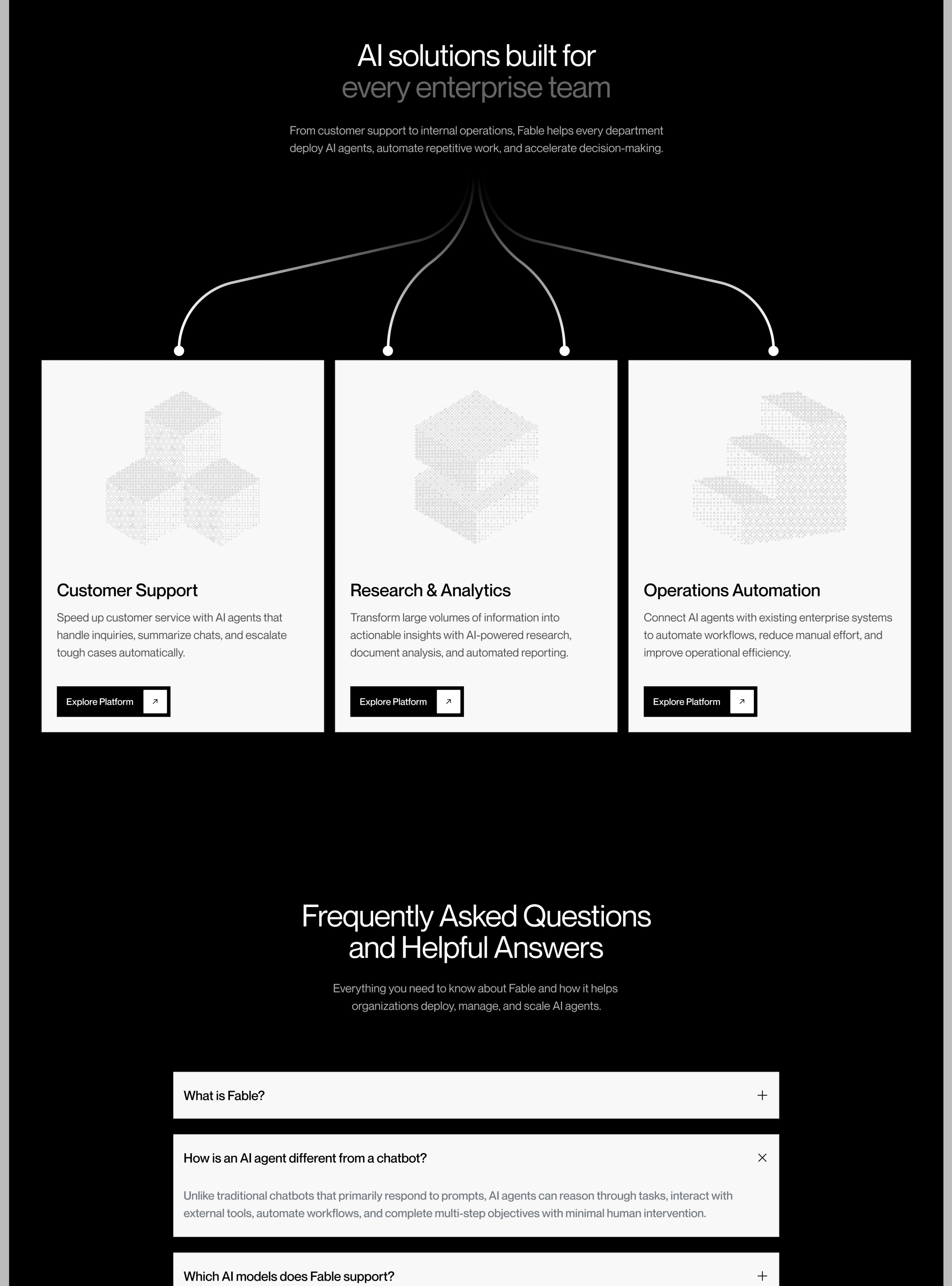
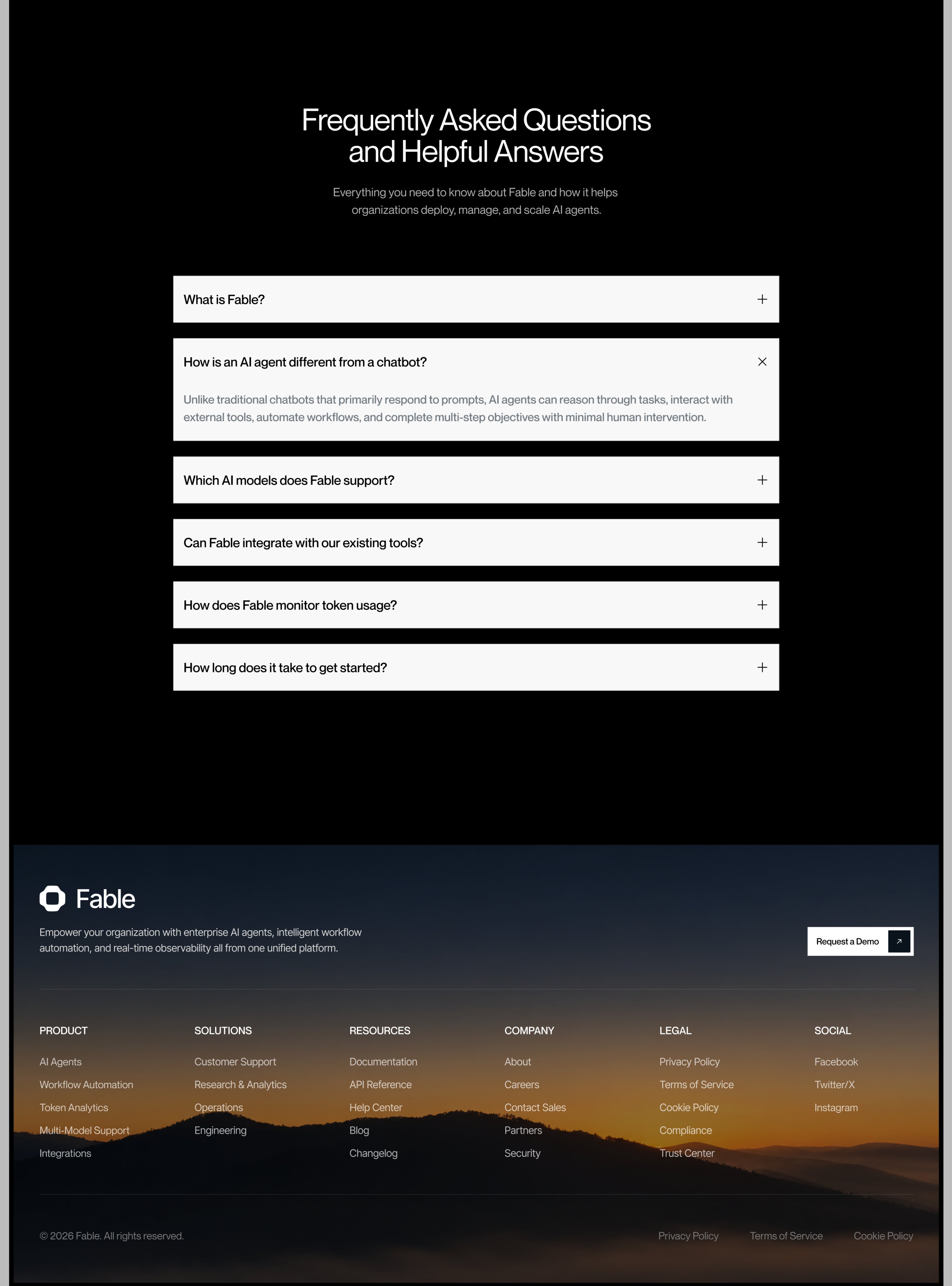
Concept landing page for "Fable" (enterprise AI agents), a design shot, not a live site. Same designer and recipe as the MeetSense page (2026-11-08-uisabor-meetsense-landing.md), here in near-black: a dusk mountain photo the frosted-glass dashboard sinks into, light sans headlines with the second half in grey ("The AI integration layer / for modern enterprises."), stats with a grey unit (1.8B, 48M), white-on-black square buttons with a separate arrow cell, thin curved lines fanning from a heading into three light cards with dotted isometric illustrations, and the dusk photo again behind the footer to bookend the page. Reference for a dark, calm product page.
2026-11-10 · 2026-11-10-uisabor-fable-enterprise-ai-landing.md · +3 media
Three app sign-in screens (Bubble "Meet new people around the world", Pivo, SkyDeal) animating in. Order: a soft photo/clouds top, then the headline with one blue word, then avatars and stickers (a heart, a flame, an orange) popping in, and the Apple/Google buttons last. Hero art fills the top 60%, auth sits at the bottom. The Bubble screen (avatars with flag badges around the globe) is a good starting point for a WannaChat welcome screen.
2026-11-10 · 2026-11-10-seyiProducts-landing-screens-animation.md
Four landing-page heroes, each from one prompt (prompts sold on his own pinstack.app, so it's an ad). Why they look good: one big rendered 3D/painterly visual carries the page, headline in two short lines bottom-left at large size, tiny grey body copy + black pill CTA at right, near-empty nav. Best one: an ElevenLabs-style concept, an iridescent blue particle blob that morphs per product tab (agents, music with radial bars, speech-to-text with waveform, cloning as twin blobs) on an off-white page. Others: dark finance hero with a sunset-gradient app window and chat bubbles; a green felt-texture landscape; a marbled green card hero.
2026-11-10 · 2026-11-10-pankajstwt-one-prompt-hero-sections.md · +3 media
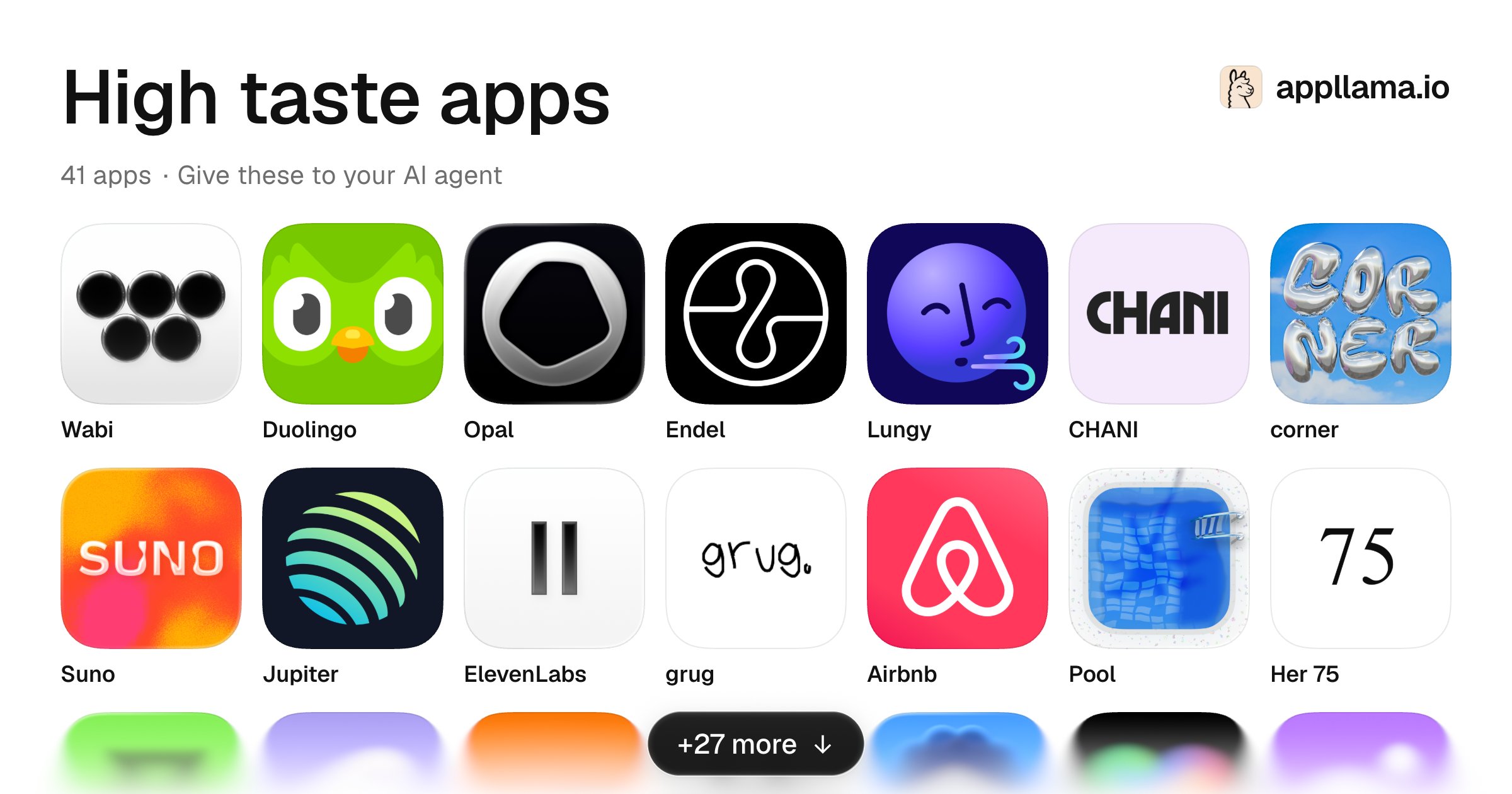
An ad for Appllama, a Mobbin-like library of iOS screens with revenue numbers and an MCP. The image is a grid of 14 app icons Appllama calls "high taste" (Wabi, Opal, Endel, Lungy, CHANI, corner, Suno, Jupiter, ElevenLabs, grug, Pool, Her 75…). Why they look good: one bold idea per icon, either a single glyph on flat black/white or a single rich material (chrome, liquid, gradient blur), and no small detail. A reference for WannaChat's icon. The other 27 apps are behind the "+27 more" on appllama.io.
2026-11-10 · 2026-11-10-jaimintf-high-taste-app-icons.md
Framer landing concept "Fluence AI". What makes it look good: one rich illustration (night city in deep blue + one hot orange accent, monorail curving through) frames a dark hero whose centred headline sits on a live chat-prompt box with agent chips ("Email responder", "Sales lead qualifier") cycling under it, so the product is shown, not described. The scroll then flips to an off-white section: logo strip, then a problem statement that reveals word by word (grey to black) on scroll, with orange-icon pain-point rows. Reusable for WannaChat marketing: illustration-as-frame hero + scroll-revealed problem line.
2026-11-10 · 2026-11-10-hello_amani-fluence-ai-landing.md · +1 media
Four empty states (projects, notifications, payments, inbox), one recipe: a two-tone headline (black fact "No payments yet." + grey next step "Send your first invoice."), one small black-line isometric illustration that animates, one grey line of why, one pill button with an arrow. What makes it work: lots of white, left-aligned, the illustration is the only drawing. Fits WannaChat's empty chat list ("Inbox is quiet. Say hello first.").
2026-11-10 · 2026-11-10-desdivj-empty-states.md · +3 media
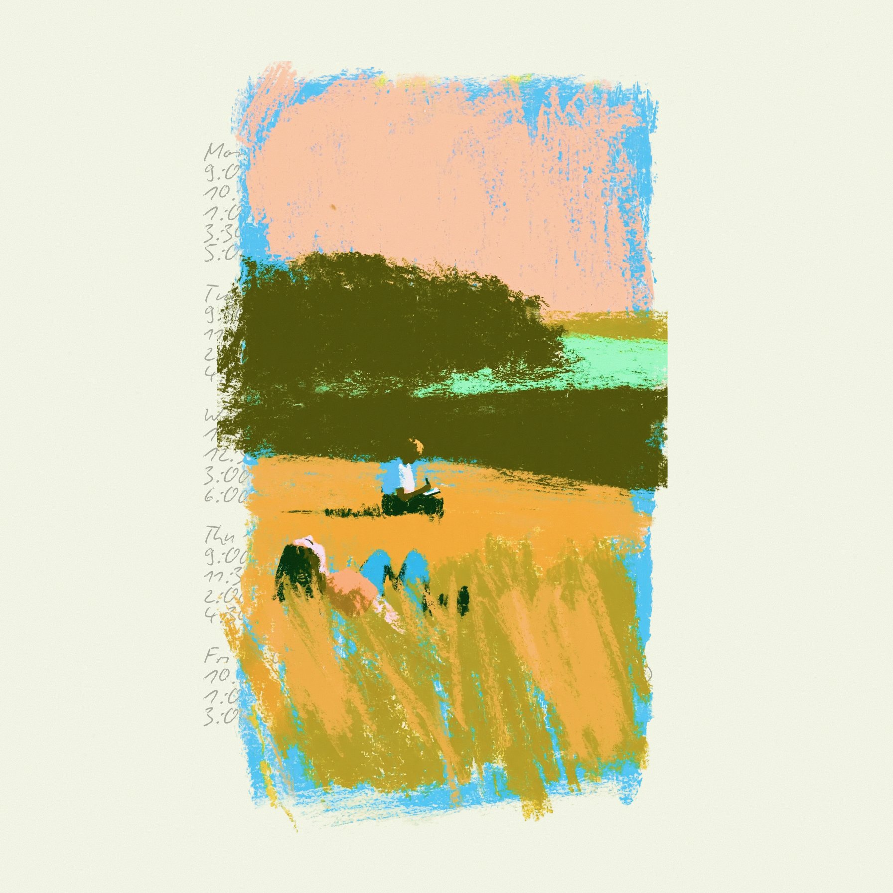
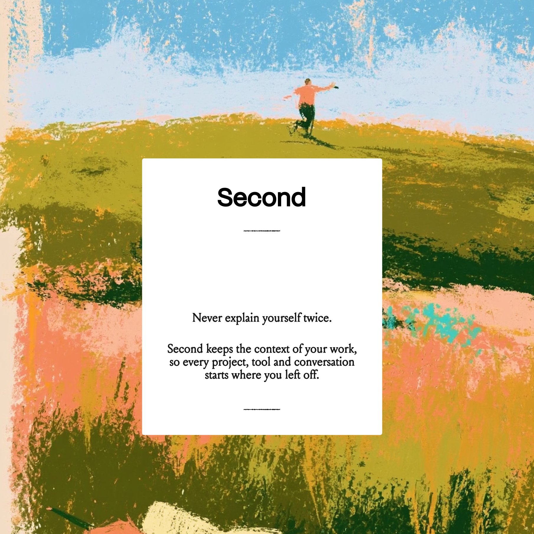
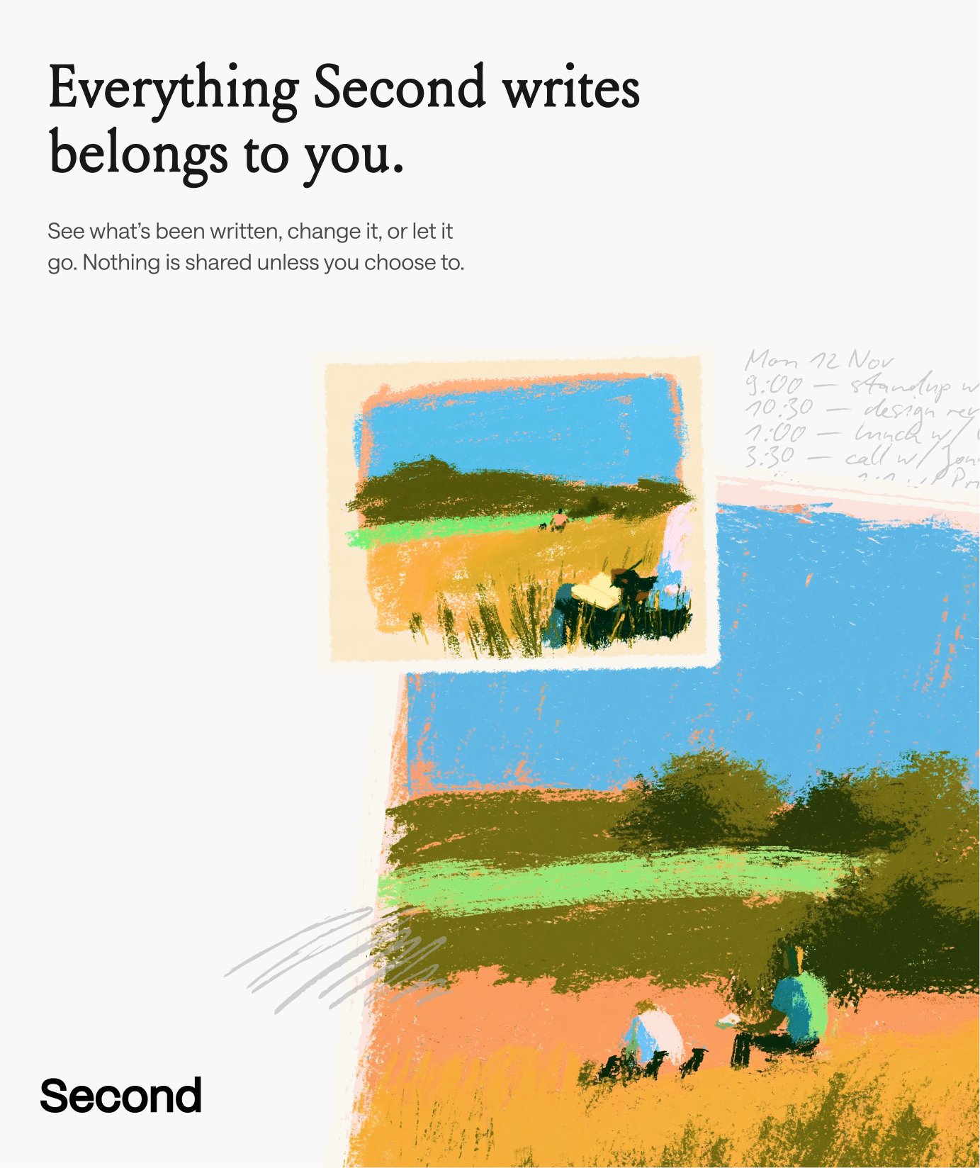
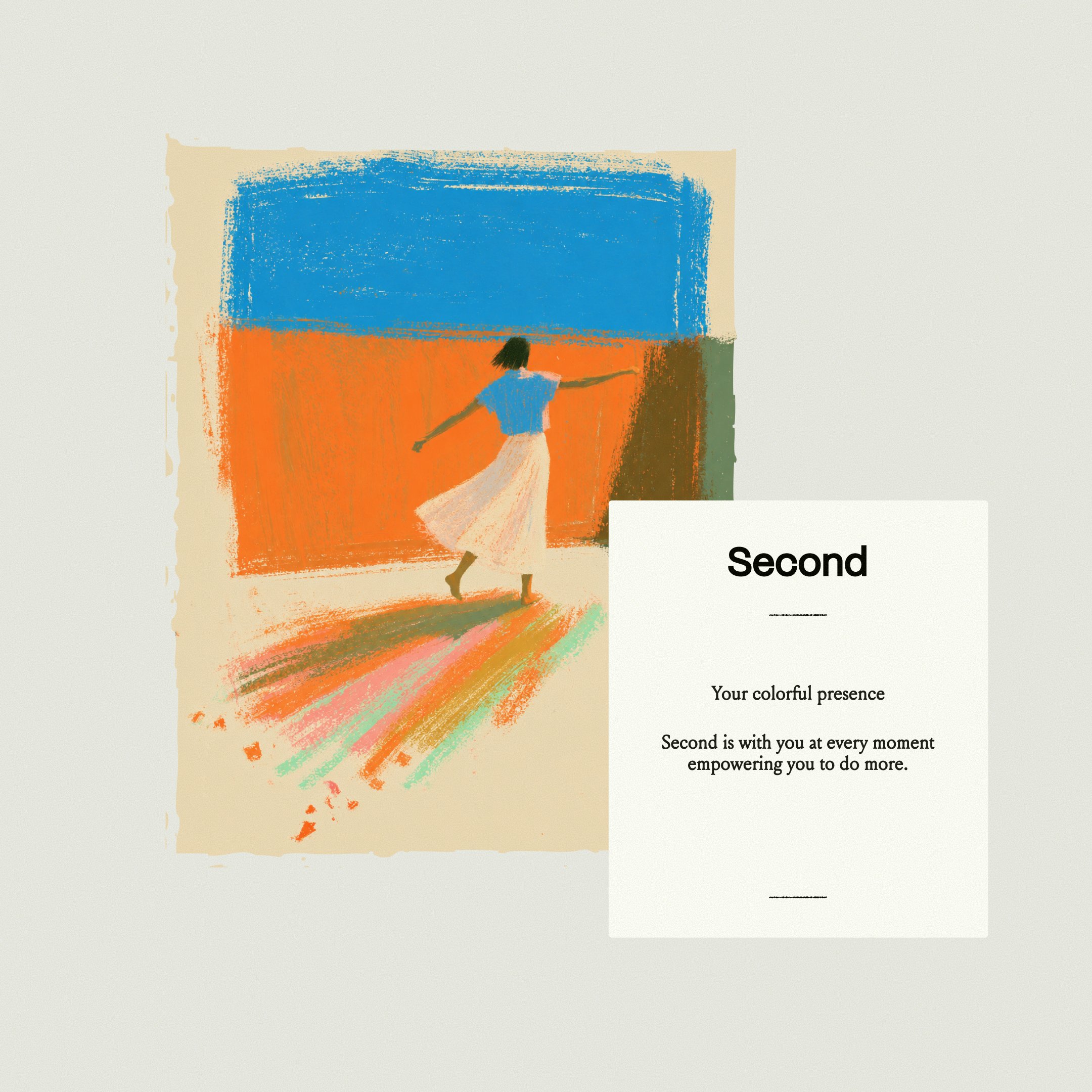
Brand identity for "Second", an AI work-context/memory app. Warm oil-pastel illustrations (thick crayon strokes, ragged paper edges, people in fields, saturated orange/sky-blue/olive) next to plain white cards with a bold grotesk wordmark and small serif body copy, plus faint handwritten schedule notes as texture. It looks good because hand-made, imperfect art is set against strict, quiet typography with lots of off-white space: an AI product that feels human, not techy. Reference for a warm WannaChat or marketing look.
2026-11-10 · 2026-11-10-ayushsoni_io-second-brand-identity.md · +3 media
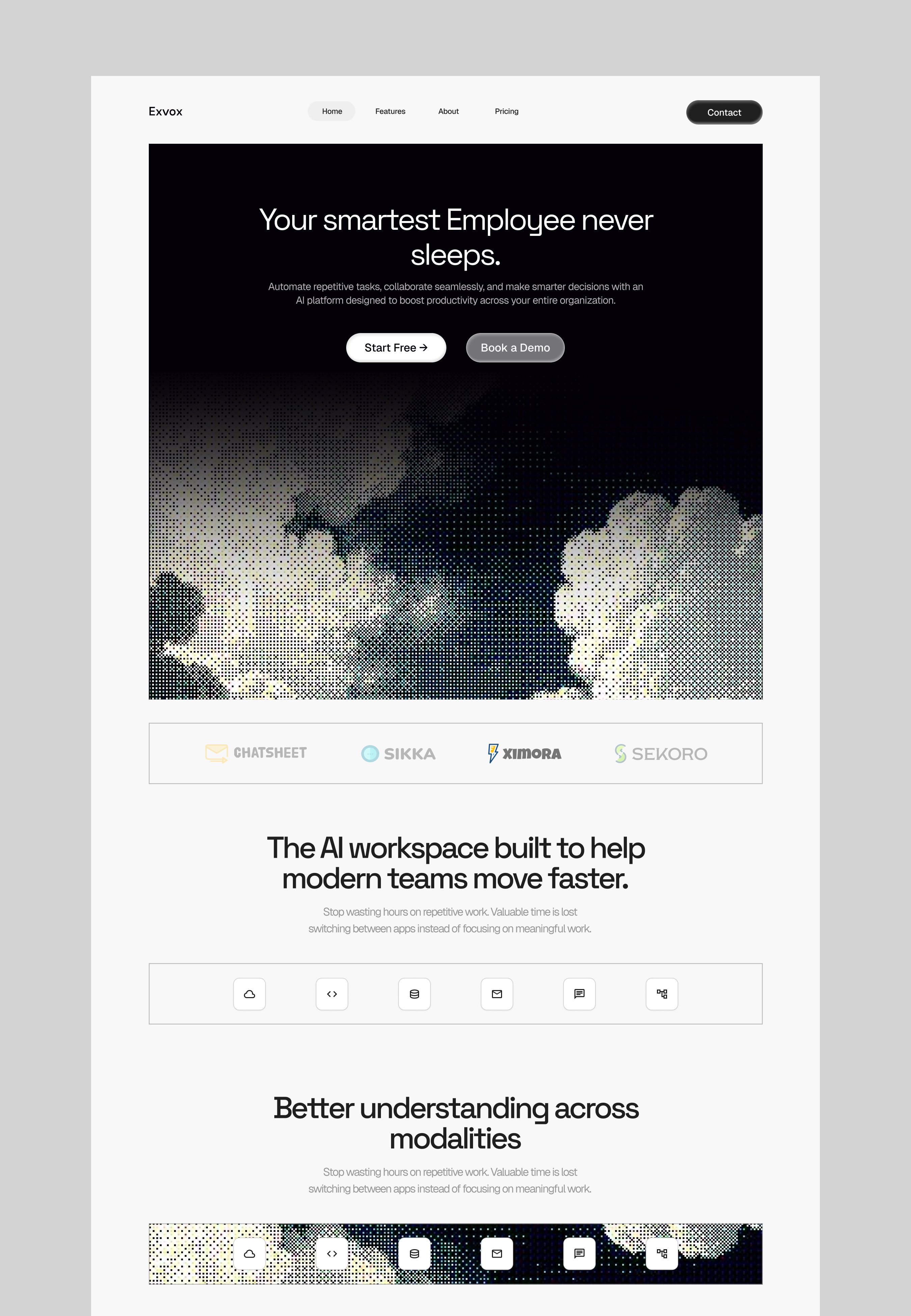
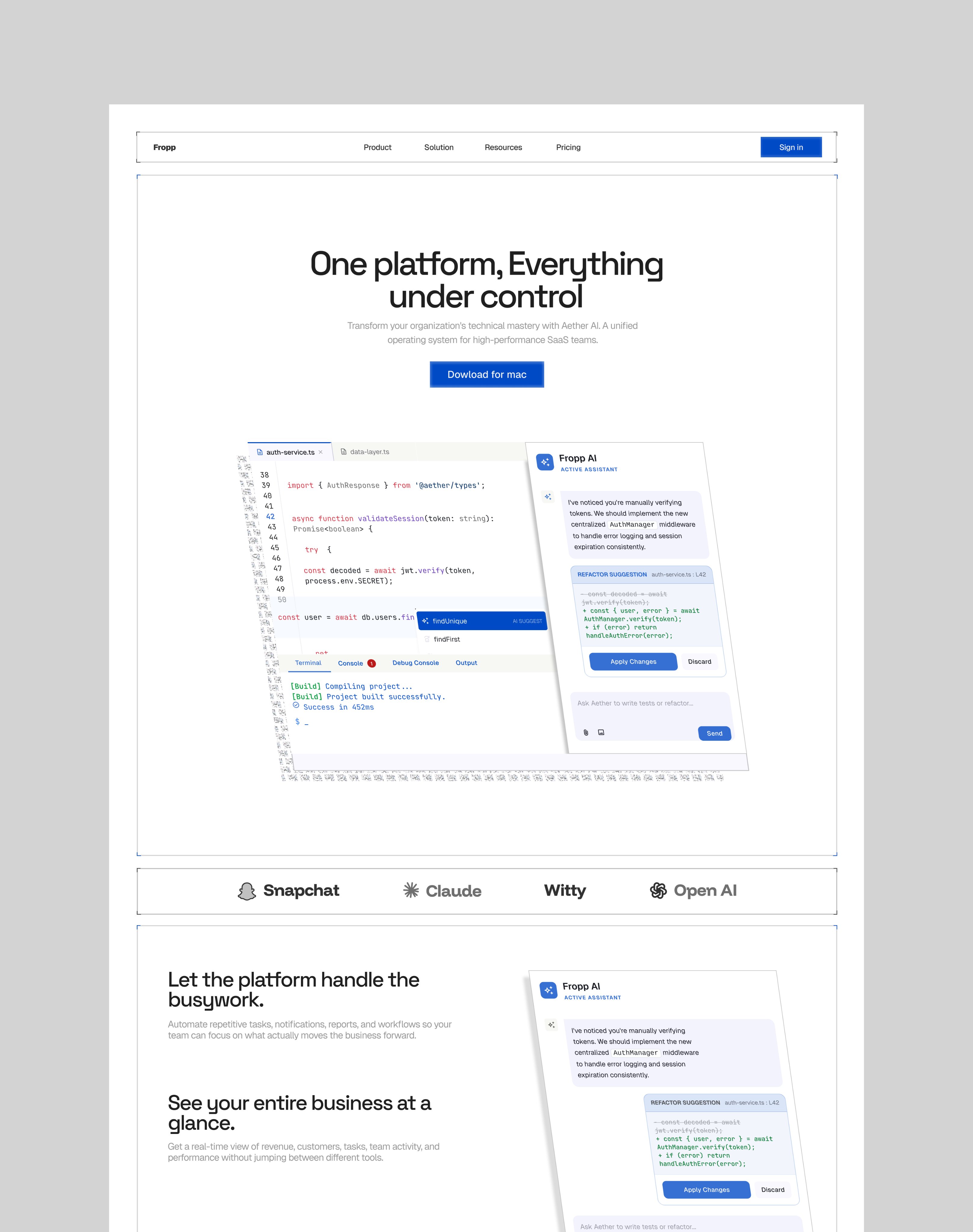
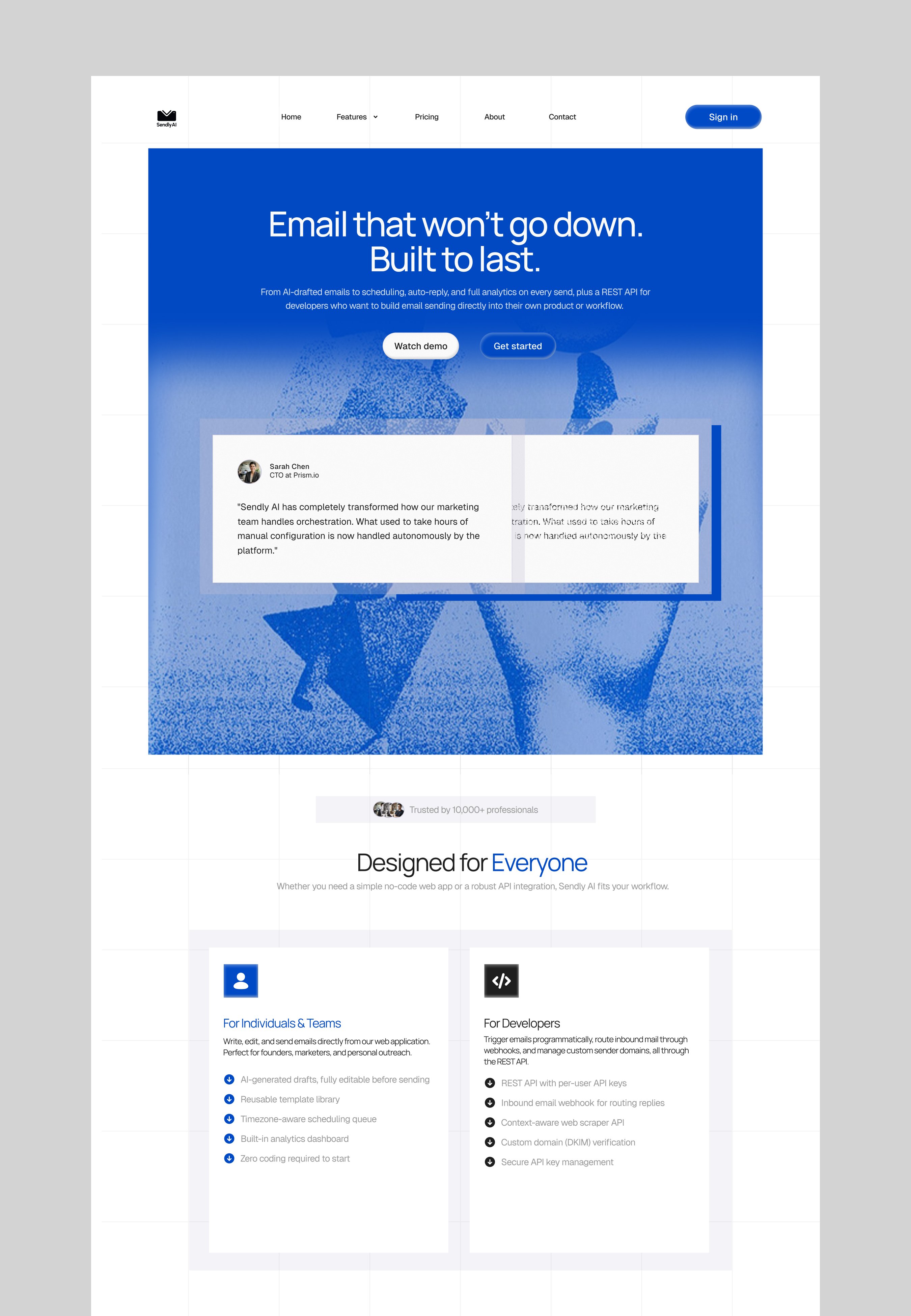
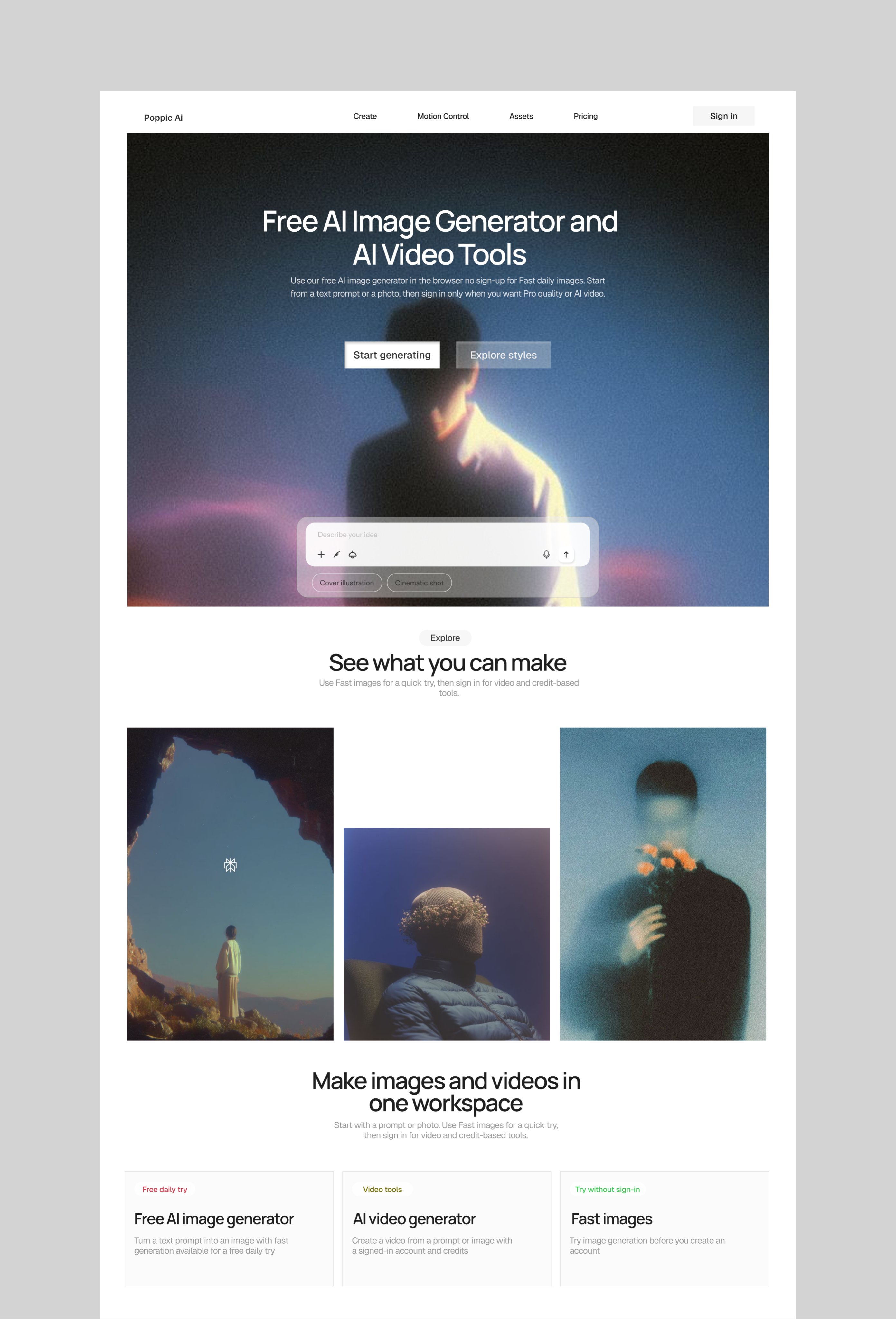
Four SaaS/AI landing concepts (Exvox, Fropp, Sendly, Poppic) in one consistent system. What makes them look good: a single framed hero image treated with a texture (halftone/dither clouds, blue-duotone grain, soft film-grain portrait) behind a short centred two-line headline and two pill CTAs; then thin hairline-bordered bands (logo strip, icon row) on a light grey canvas with faint grid lines, generous white space and one accent colour per site. Fropp shows the product itself (code editor + AI side panel) as the hero instead of a picture. Reusable for WannaChat marketing: textured-image hero + hairline-boxed sections.
2026-11-10 · 2026-11-10-ayodeleee_-saas-landing-set.md · +3 media
A 5.6s reel of polished UI components, each on plain white with one soft shadow. What makes them look good: dark cards with a vivid mesh-gradient top half and one white logo (AI model picker cards, fanned out isometrically to show the set), a serif heading over small grey body text, one white pill CTA with ↗, and a dark footer with a full-bleed photo hero and hairline column dividers. Model-picker cards are a direct reference for any "choose a voice/character" screen in WannaChat.
2026-11-10 · 2026-11-10-Skirook-design-component-collection.md
Onboarding as a conversation with mascots: a crew of blobby letter-characters (the user's typed name turns into letter blobs) asks one question per screen in a chat bubble, then personalises (work type wheel, "what eats your week" checklist the crew jumps onto), shows a real first task before the paywall, and ends in confetti with "You're all set, Ritu!". Calm white cards on a pastel mesh-gradient background, one dark full-width CTA per screen. Reference for WannaChat onboarding: the character speaks, the user answers, value before the trial ask.
2026-11-10 · 2026-11-10-BThreeAgency-letterly-mascot-onboarding.md
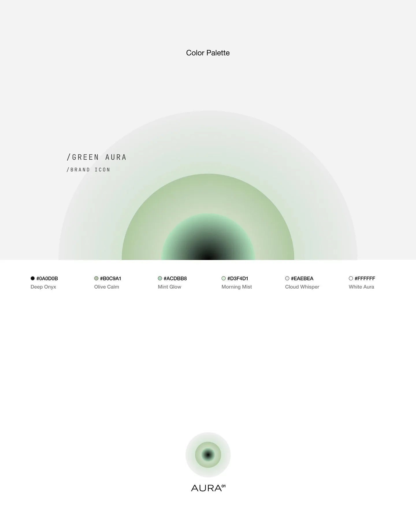
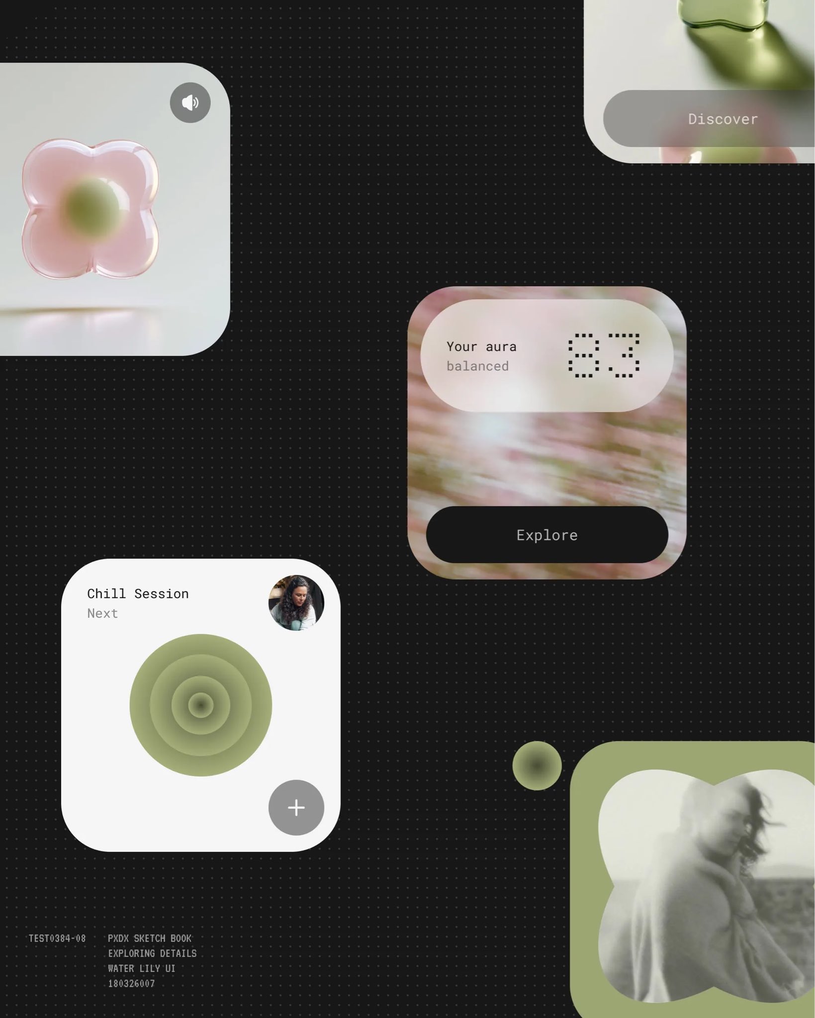
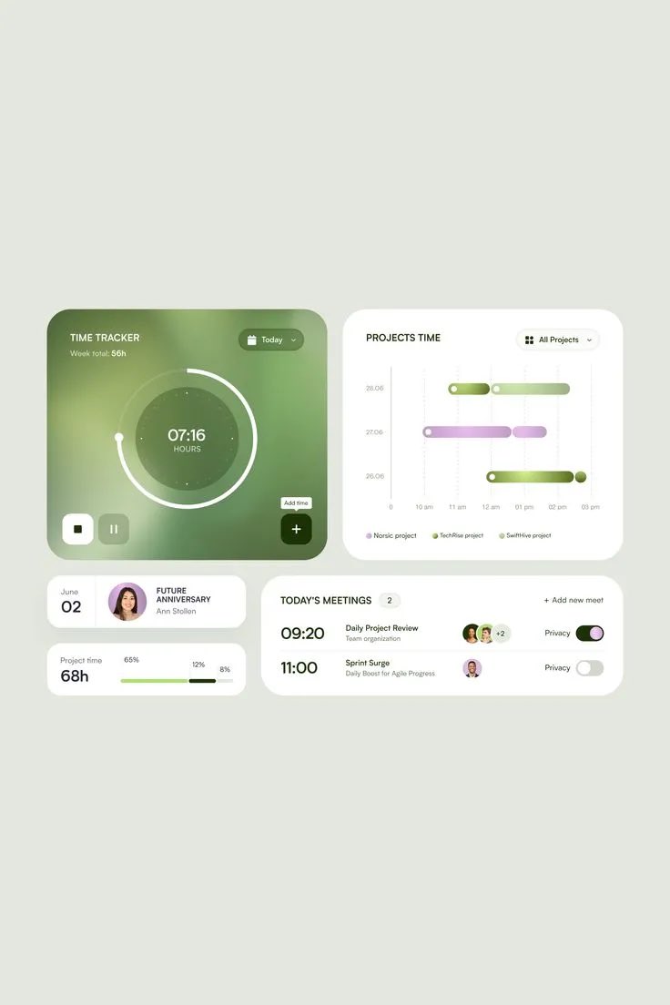
UI moodboard, no text or technique. A soft "aura" look: blurred green/pink gradient blobs inside big rounded cards on warm grey, small mono labels, one dark accent. Photo 4 (the linked one) is a green glass-gradient dashboard (time tracker ring, Gantt bars, meeting toggles). A reference if a WannaChat screen or page wants a calm, organic look.
2026-11-08 · 2026-11-08-x6sense-aura-green-ui-moodboard.md · +3 media
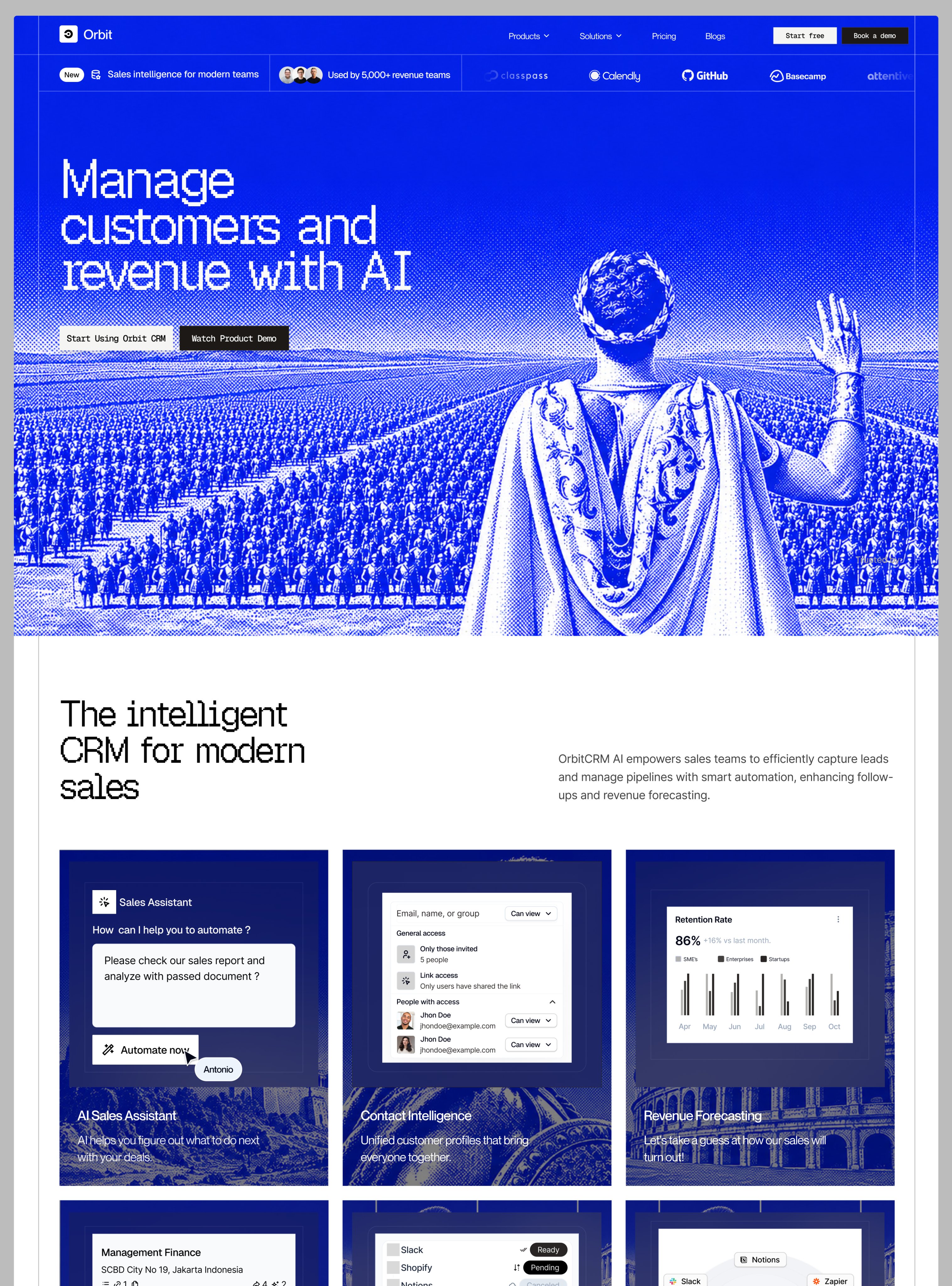
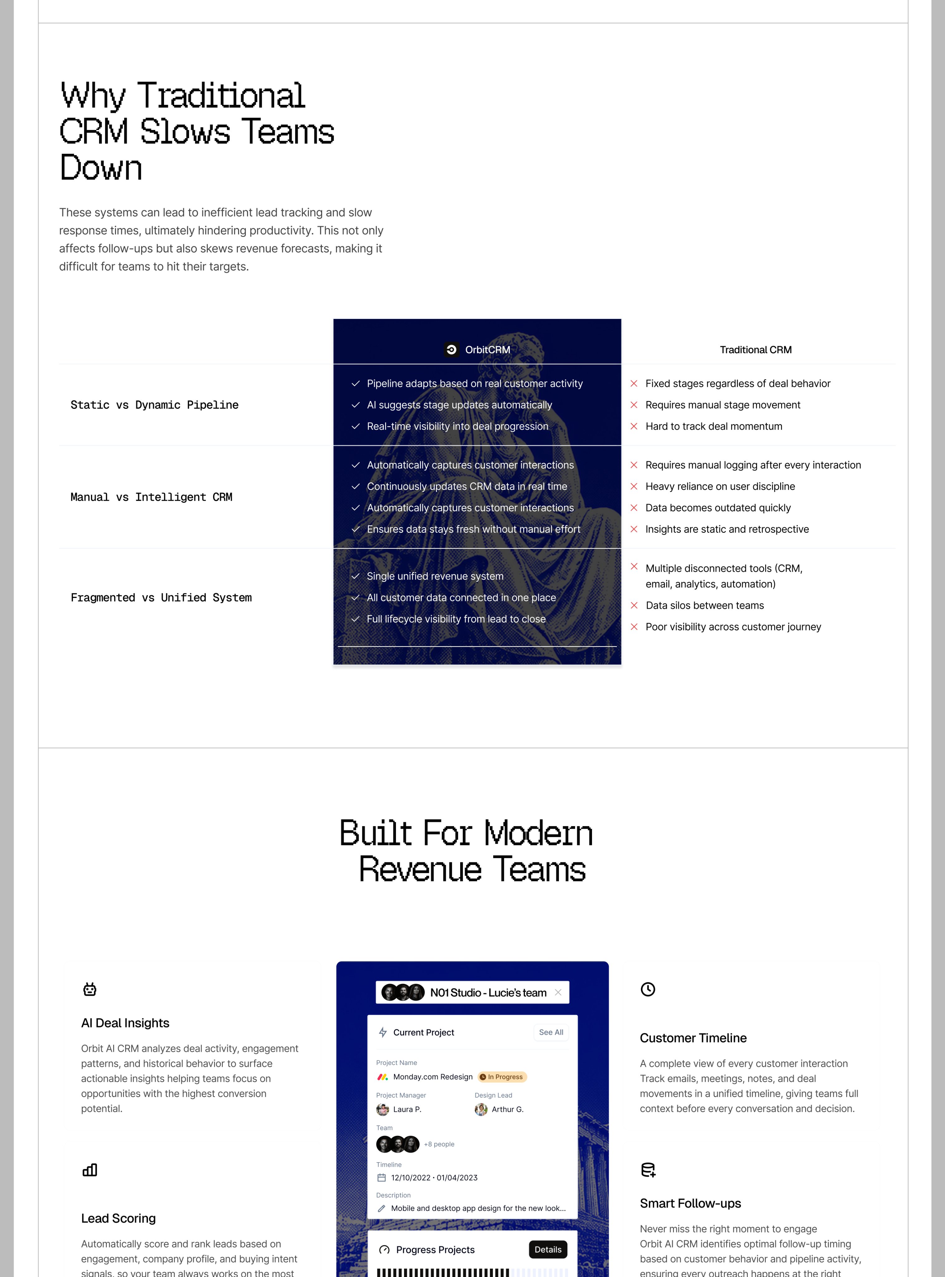
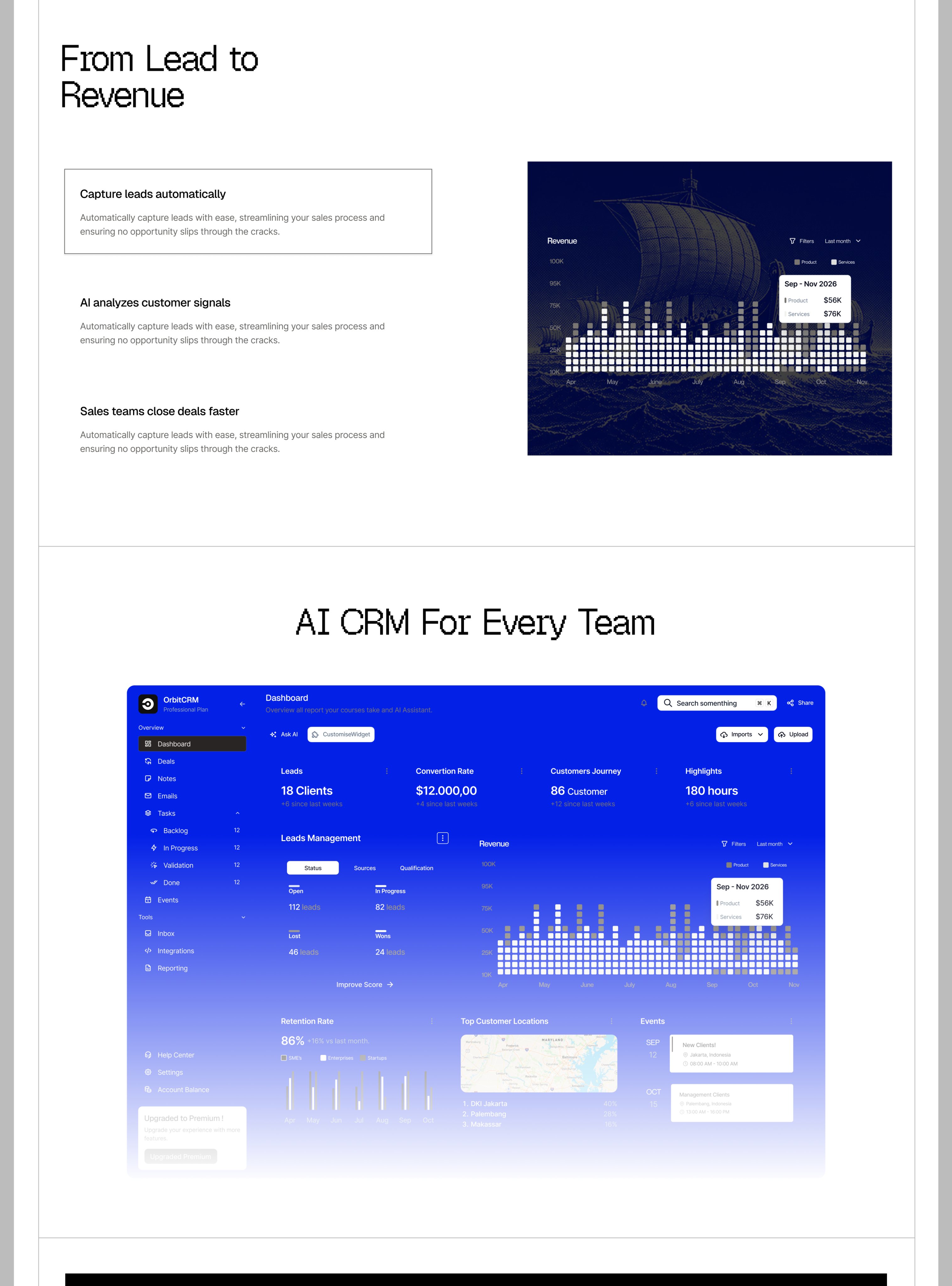
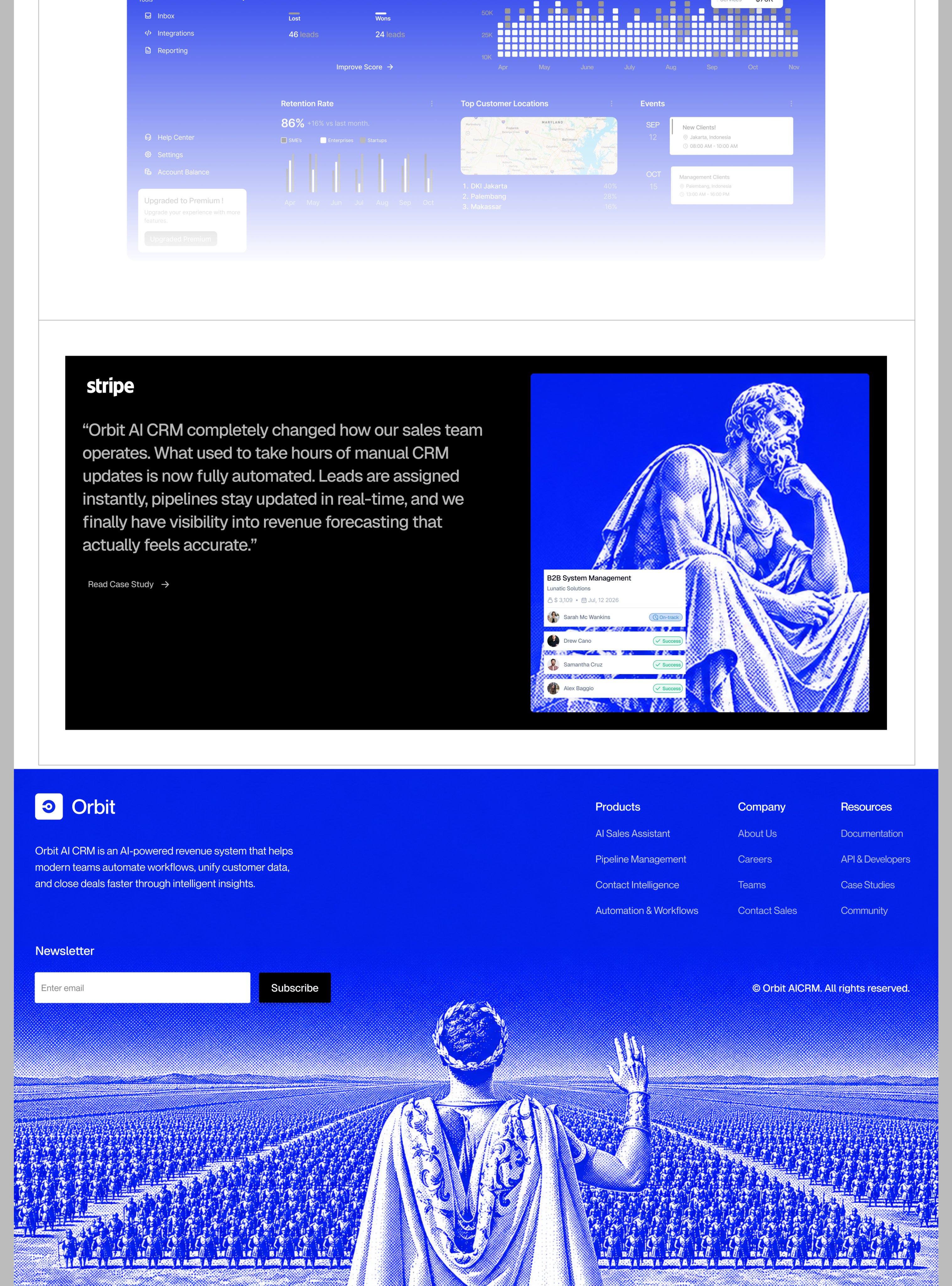
Concept landing page for "Orbit", an AI CRM, shown as a design shot and not a live site (same designer as 2026-11-08-uisabor-meetsense-landing.md). What it does: one electric-blue duotone on halftone/engraved classical art (an emperor before a legion, a ship, a Thinker) carries the whole brand. The same image opens and closes the page, the product UI sits on top of the art, and a typewriter-mono display face plus a black testimonial box are the only other moves. Takeaway for WannaChat marketing: one bold colour applied to old public-domain art can give a page its identity without any custom illustration.
2026-11-08 · 2026-11-08-uisabor-orbit-crm-landing.md · +3 media
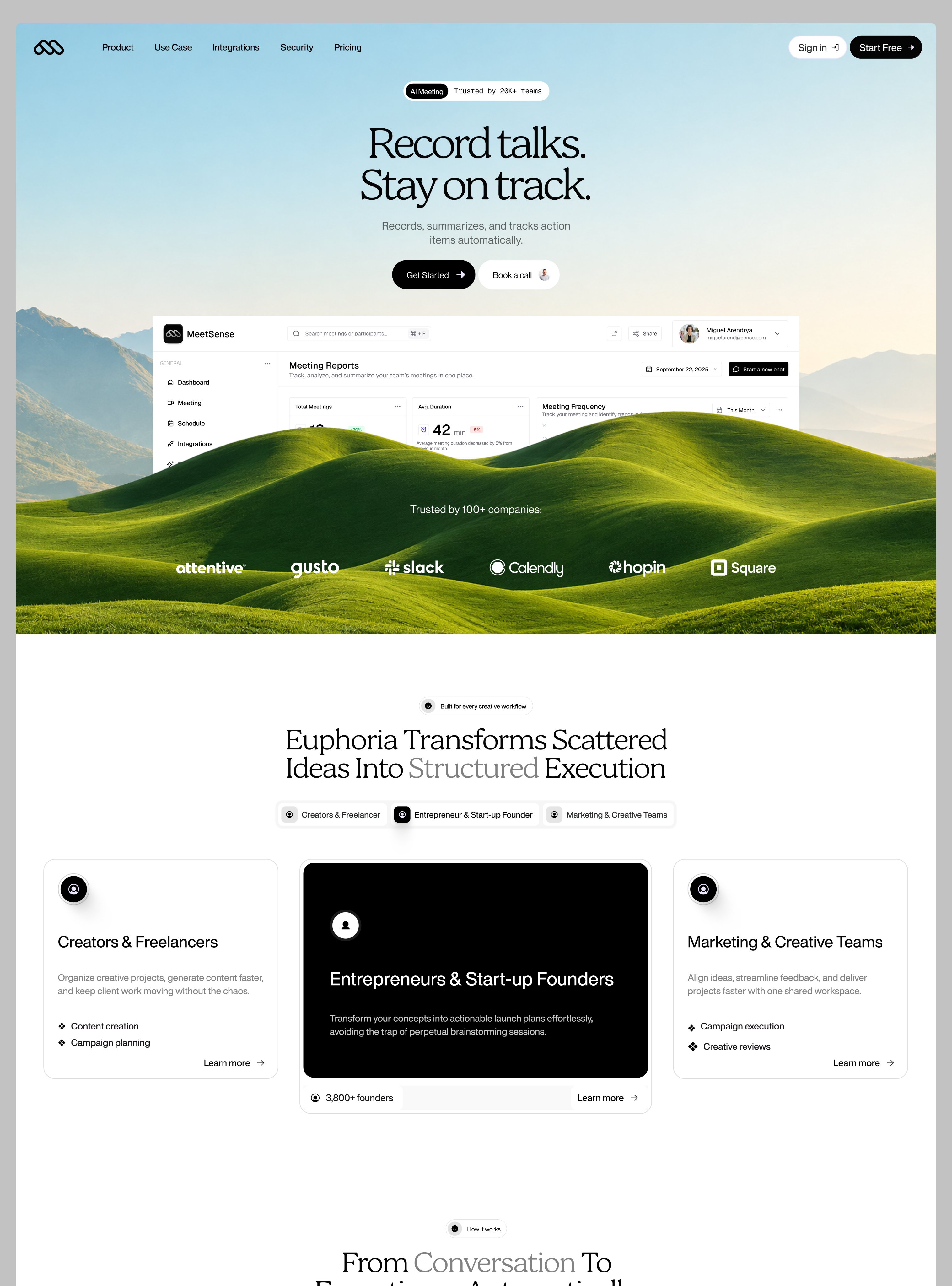
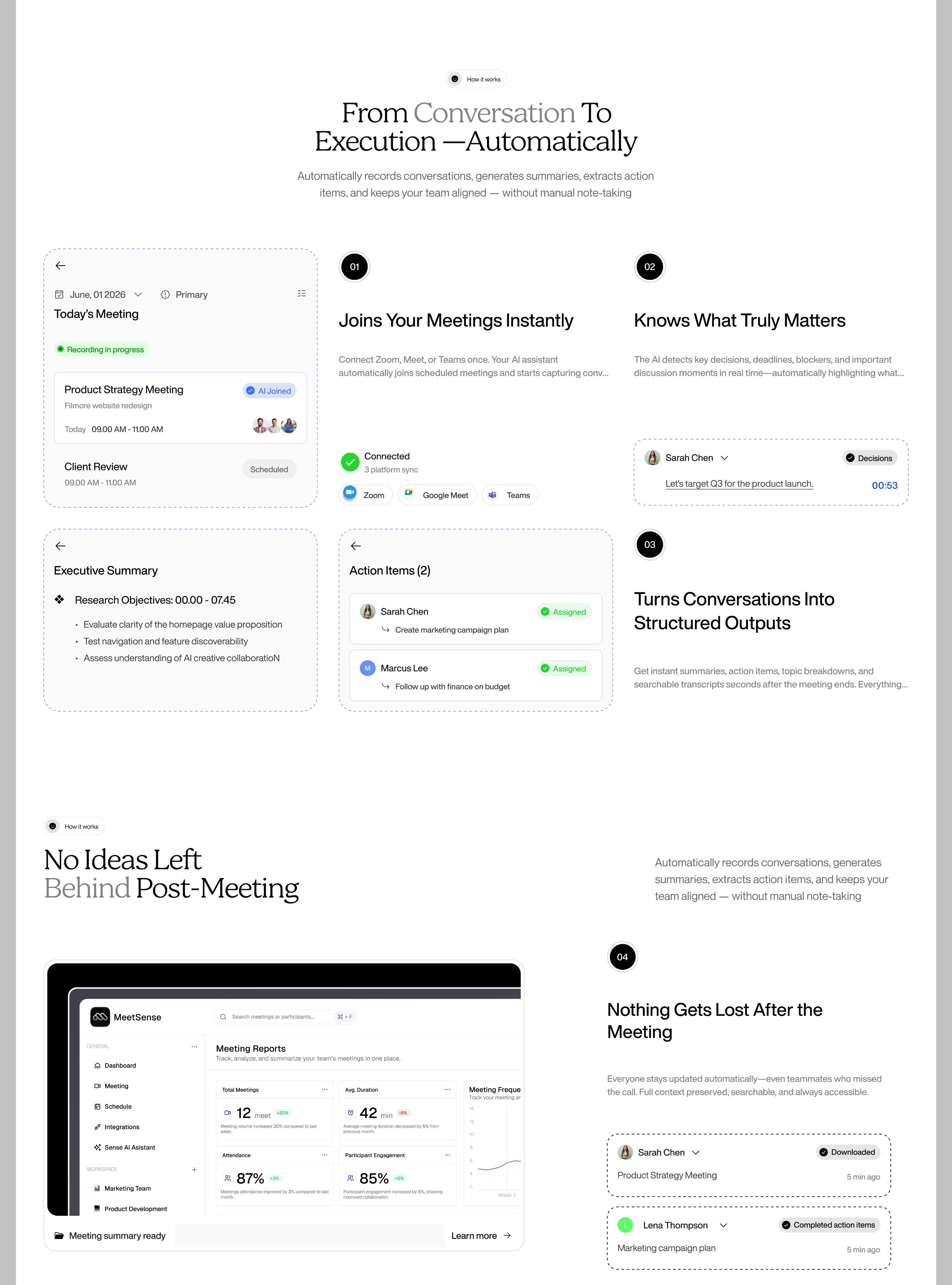
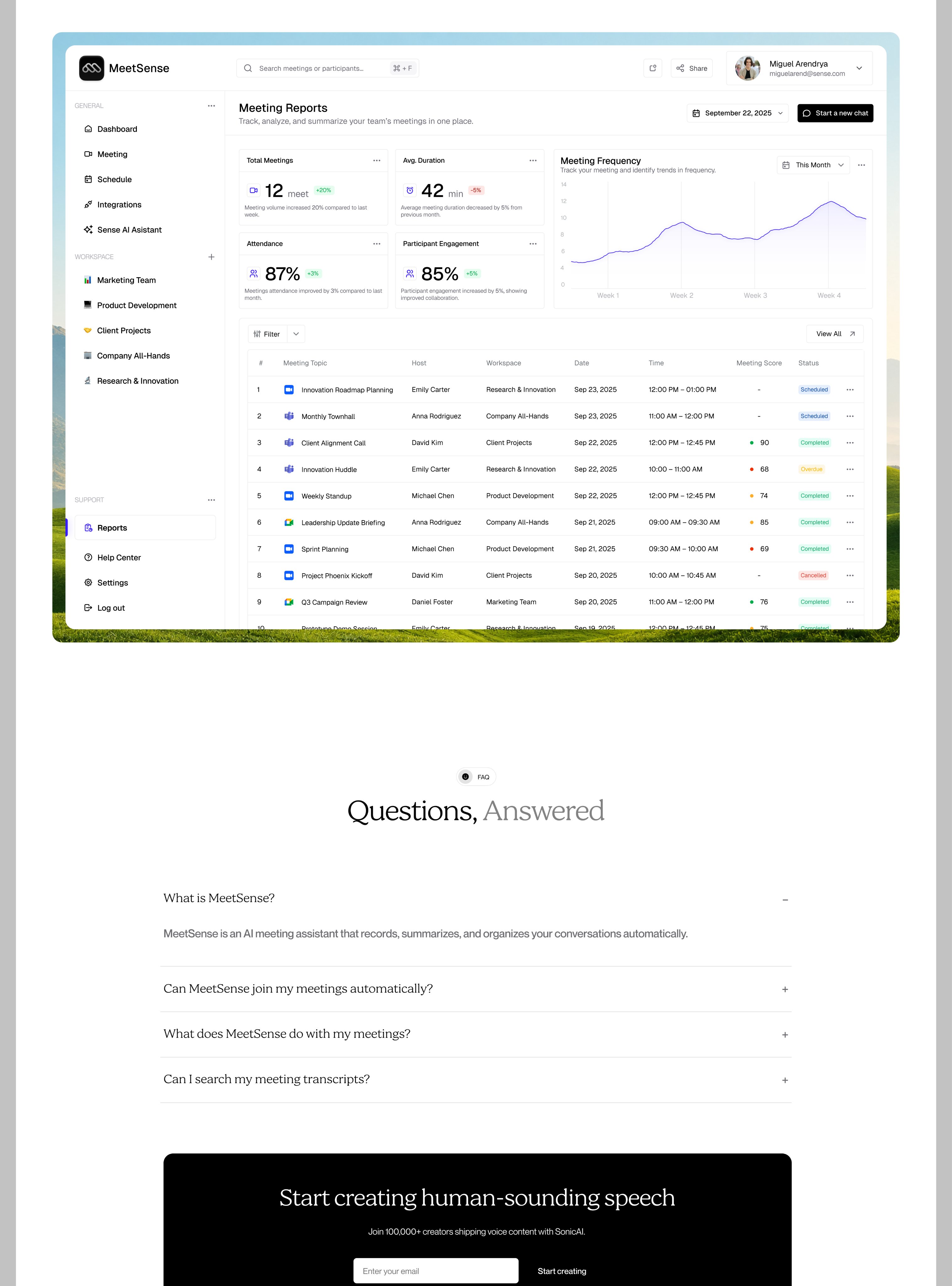
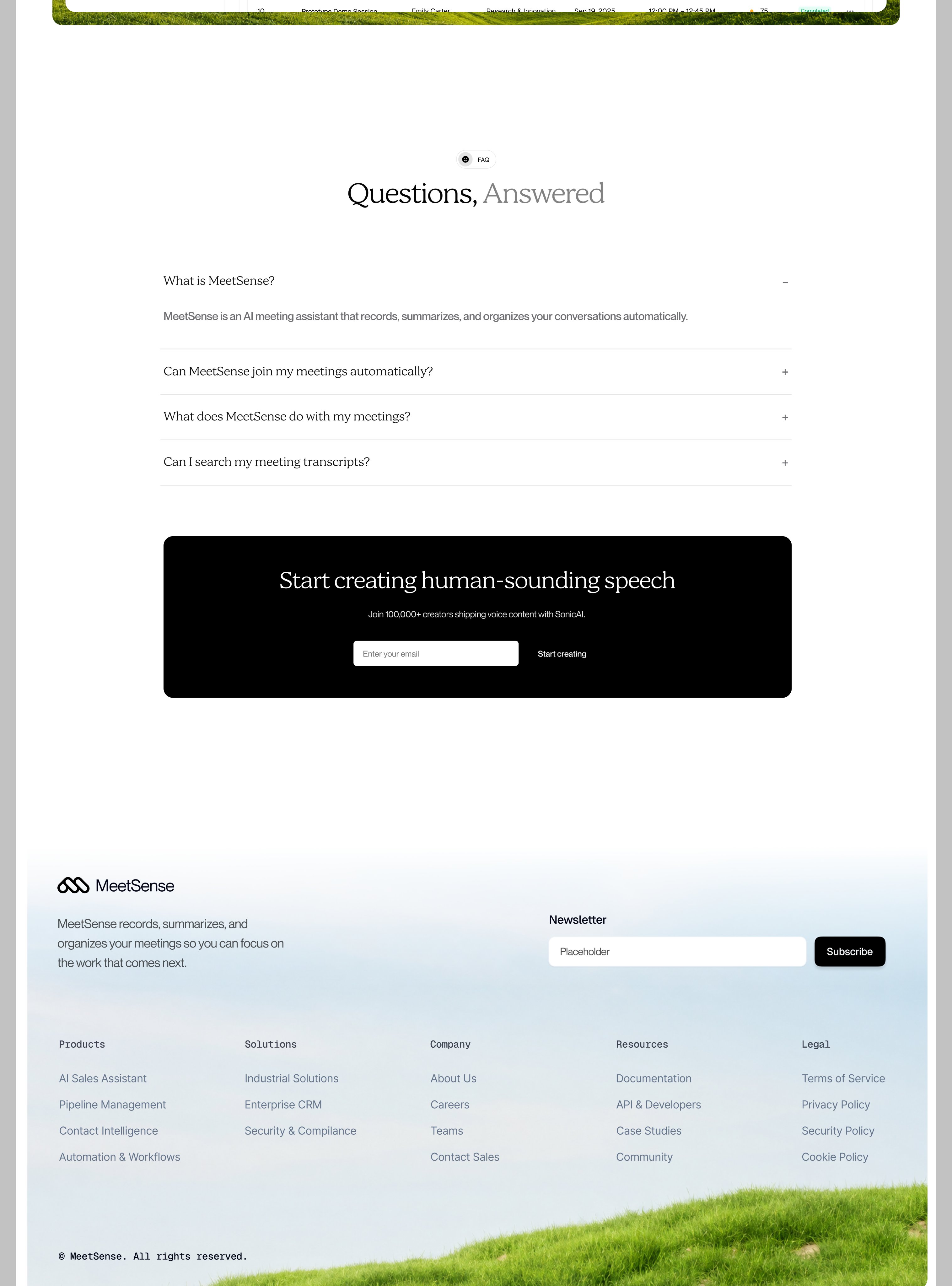
Concept landing page for "MeetSense" (AI meeting notes), a design shot, not a live site (copy mixes in "Euphoria" and "SonicAI"). What makes it work: a light serif display headline ("Record talks. Stay on track.") with one grey word for emphasis, a real photo backdrop (sky to green hills) the product screenshot sinks into, tiny pill eyebrows above each section, mono-type footer labels, and the same landscape reused at the bottom to bookend the page. Worth borrowing for a WannaChat marketing page that should feel calm rather than SaaS-generic.
2026-11-08 · 2026-11-08-uisabor-meetsense-landing.md · +3 media
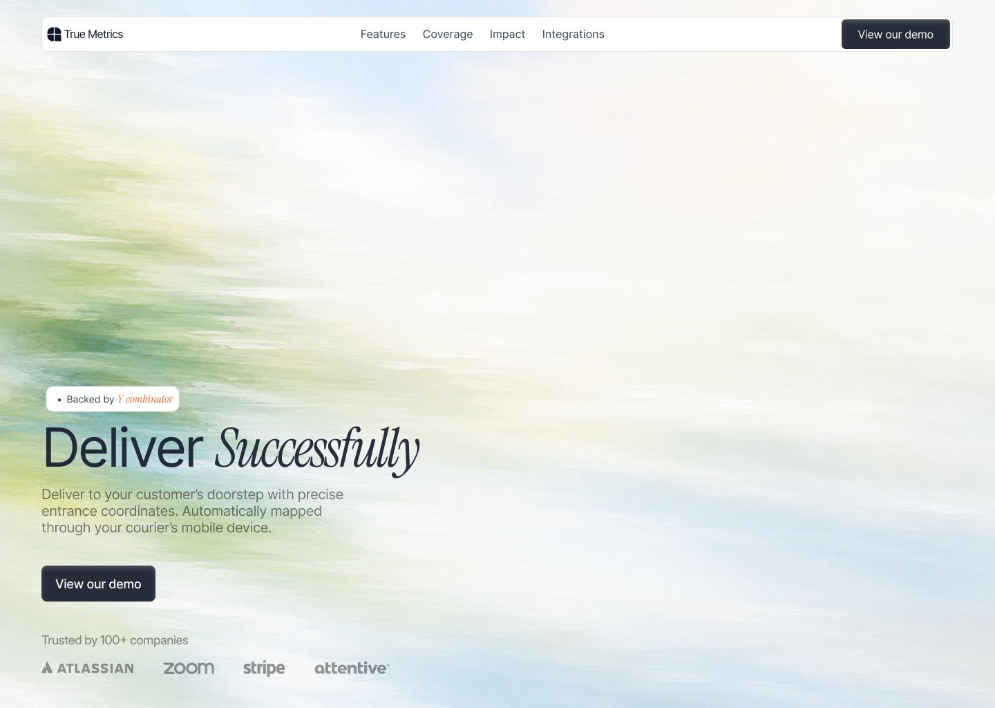
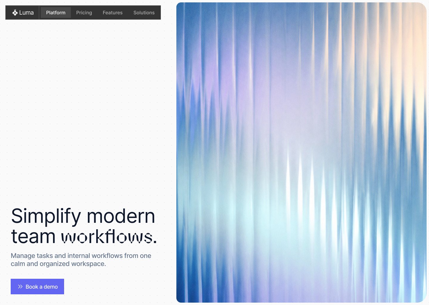
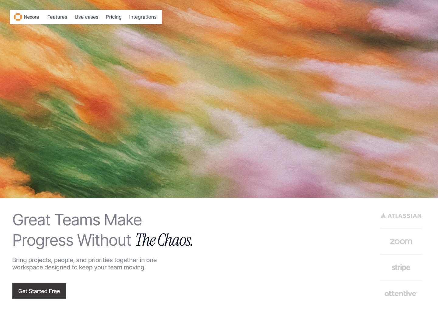
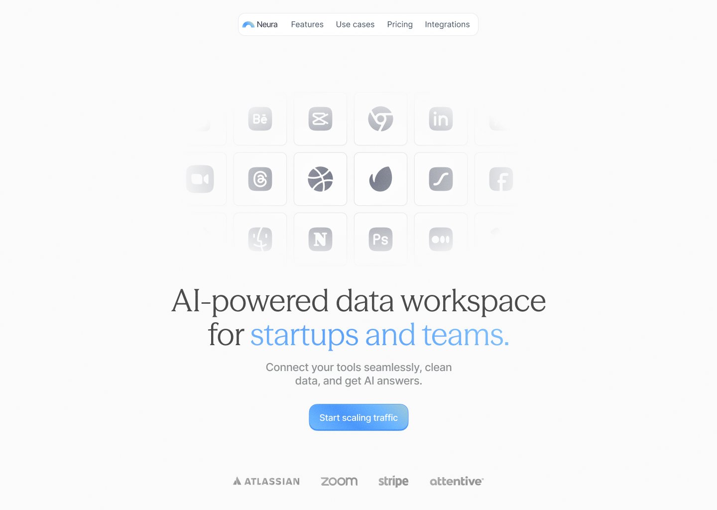
Four concept SaaS hero sections (design shots, not live sites; all reuse the same Atlassian/Zoom/Stripe/attentive logo row). The shared trick: one big painterly or motion-blur texture (brush-stroke landscape, vertical light streaks) carries the whole mood, with a plain sans headline plus one italic-serif accent word ("Deliver *Successfully*", "Without *The Chaos.*") and a small floating pill nav. The fourth swaps the texture for a fading grid of app icons. Same calm-not-generic direction as [[2026-11-08-uisabor-meetsense-landing]]; worth a look for a WannaChat marketing hero.
2026-11-08 · 2026-11-08-uihssn-weekly-design-recap.md · +3 media
Claude Code built a path-traced 3D kitchen shot from one AI still: camera solved from the still's vanishing points, scripted set build, 2 critic agents comparing each round to the reference. The critic loop is already in webtoon conti3d (PROCESS.md, 2 readers + 2 critics). The one new trick for conti3d: match a set to a reference image by solving its camera (fSpy-style vanishing points → lens, eye height) before building. Tesseract is Mirage's own tool; nothing to install.
2026-11-08 · 2026-11-08-trymirage-claude-3d-scene-tesseract.md
UI concept, not a product: onboarding for a made-up AI inbox app "tuft" where you pick a fuzzy 3D companion (Mikan "bright, quick, a little bouncy"; Neko "dry, precise, secretly sweet") on a spinning planet. Worth finding later as a reference for choosing an AI character's personality: name + 3-word personality + one in-voice speech bubble ("Neko. I read your inbox so you don't have to.", "You came back!"), and a tactile first screen ("Stroke the fur to step inside").
2026-11-08 · 2026-11-08-rakshaa_t-tuft-companion-picker.md
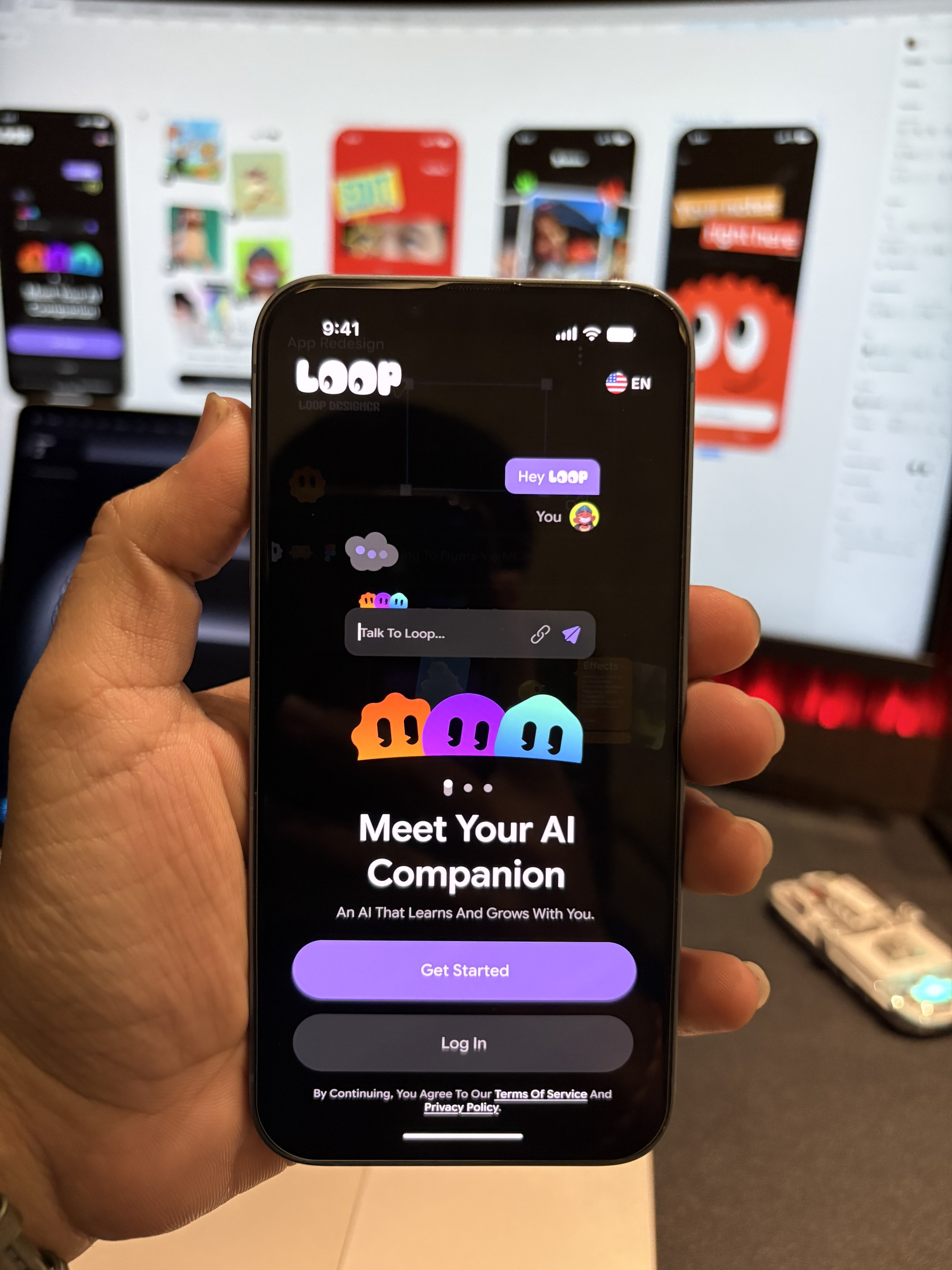
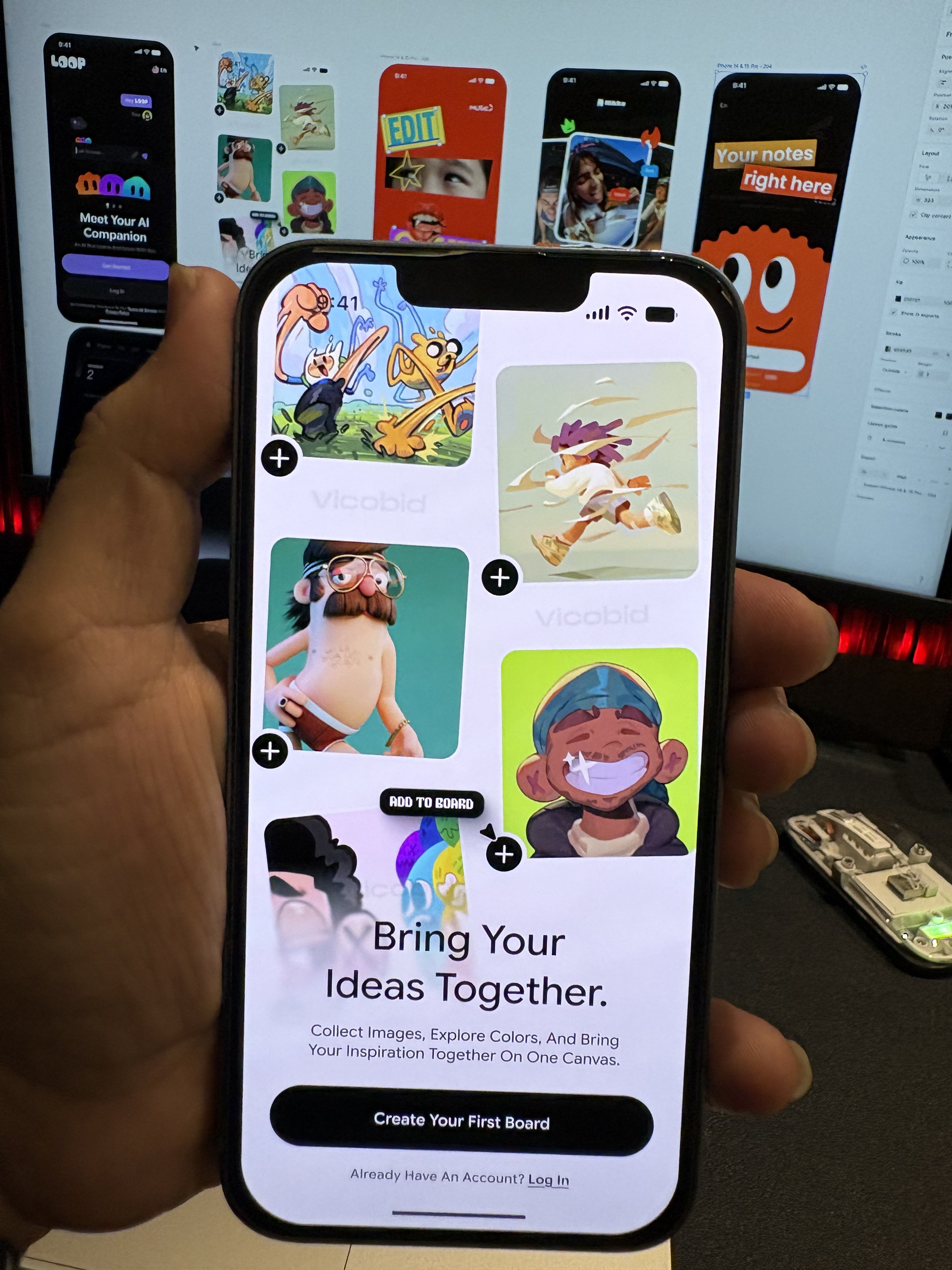
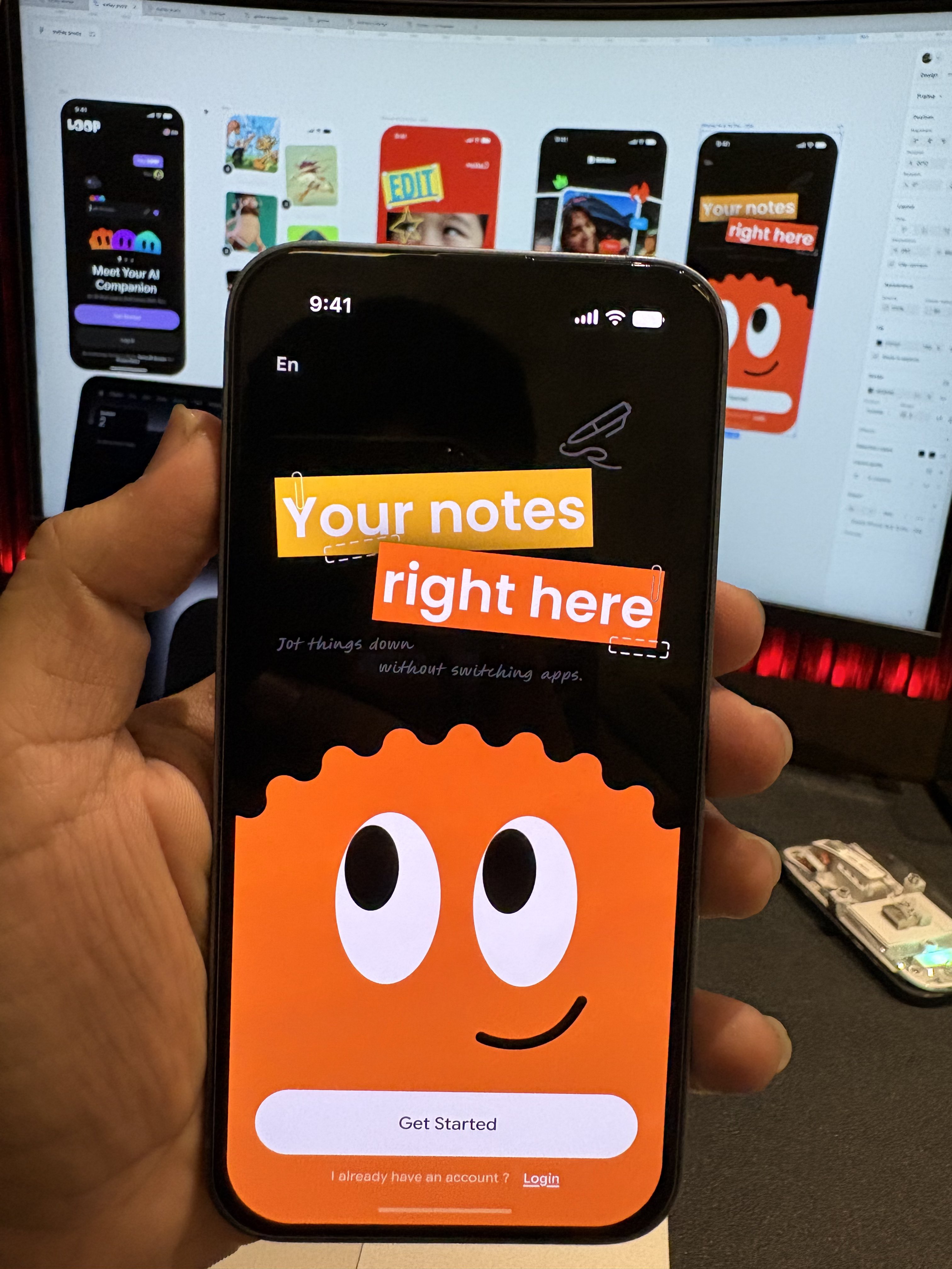
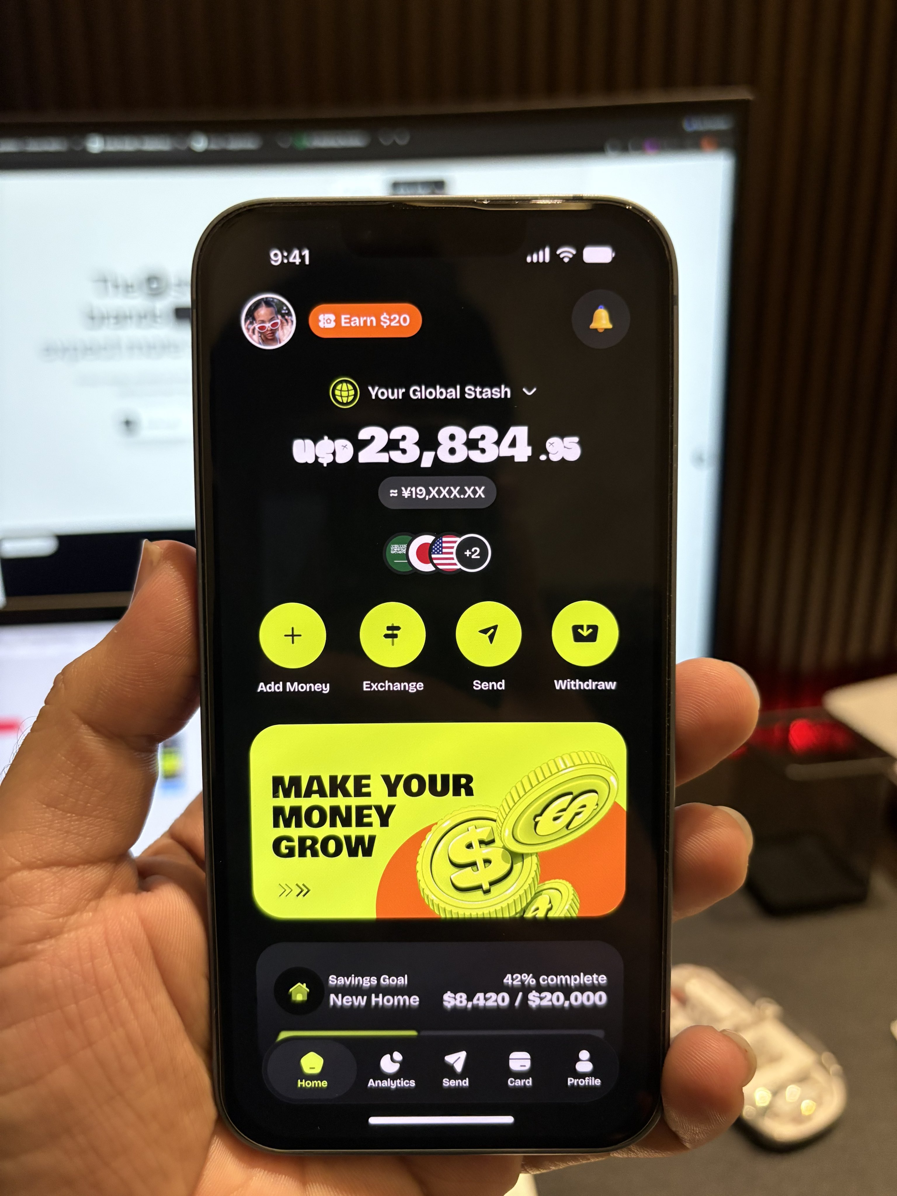
Design-agency promo. Four onboarding/home mockups (mascot blobs, sticker-style type, neon fintech) held up in front of Figma. No app names, no download or growth numbers, so "gone viral" is unbacked. Nothing to apply to WannaChat beyond the generic "a bold mascot onboarding screen screenshots well".
2026-11-08 · 2026-11-08-nikkbadlani-design-makes-apps-viral.md · +3 media
An AI-generated "Use cases" section for a fictional sales copilot ("Altura"). Layout: a warm off-white page; an accordion on the left (01 Sales teams open, with checkmarks); on the right a desert photo with a white workflow-chip diagram on top, where a pulse runs along the connector lines and the active chip glows; a dark glass stat strip below (32% / 75% / $25M+). No prompt or tool was shared (repliers asked). Worth reusing as a reference for a wannachat-marketing feature section. Stills: /home/ubuntu/Synced/links/2026-11-08-kevserctk-use-cases-section/.
2026-11-08 · 2026-11-08-kevserctk-use-cases-section.md
Companion to 2026-11-08-kevserctk-use-cases-section.md (same author, same style), for a fictional invoicing app ("Veyra"). Two sections on a warm off-white page: "Works with the tools you already use." (gray second line) above a 6x2 grid of integration tiles, one icon at a time flipping to black; then "One platform, every way you earn." with an accordion on the left (Freelancers open, checkmarks) and a desert photo on the right where an invoice card builds row by row and ends on a black "Send reminder" button. No prompt or tool shared. Reference for a wannachat-marketing integrations/use-case section. Stills: /home/ubuntu/Synced/links/2026-11-08-kevserctk-integrations-usecases/.
2026-11-08 · 2026-11-08-kevserctk-integrations-usecases.md
A design shot, no code or library. Itda's Stats page already has the same skeleton (big numbers on top, daily bars below). Worth borrowing, in order: (1) hover a bar to see that day's numbers (Swift Charts `chartXSelection`, small); (2) a small "+12 vs yesterday" delta next to the headline number; (3) a Day / Week / Month switch, only once there are months of data. Skip the stacked colour bars: Itda has one series, so they'd be decoration.
2026-11-08 · 2026-11-08-desdivj-sleep-dashboard-dataviz.md · +3 media
Design reference only, no technique or tool. 8.7 s video of four phone screens for a made-up quantum brand "Kodor": near-white cards, tiny centred text, one live 3D marble/flower orb per screen as the only colour, deep teal-to-white gradient panels. Useful as a mood reference for a calm, one-hero-object screen (e.g. a WannaChat splash or onboarding) if that style is ever wanted.
2026-11-08 · 2026-11-08-basit_designs-minimal-mobile-ui.md
Ad for scrollshaders.com (paid WebGL loop backgrounds, $239 lifetime), but the look is the point: phone screens, pricing cards and big-number stat tiles (95, 25, 48) where the whole card is one slowly moving soft mesh gradient (peach→violet, teal, amber, mono), white type on top, cards floating on an off-white page with soft coloured shadows. For WannaChat or marketing cards, try a CSS/Canvas mesh gradient as the card fill before paying for the pack.
2026-11-08 · 2026-11-08-amananimates-scrollshaders-gradient-cards.md
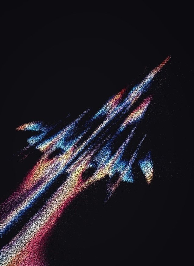
Four ASCII and dither renders of real imagery, all on near-black. What makes them work: glyphs or dots stand in for pixels but the shape stays readable, there's one tight palette per piece (orange black hole, blue crescent Earth, orange-and-white goldfish, iridescent streaks), and lots of empty black around the subject. For a Reel or landing hero, the HyperFrames `/media-use` skill already lists an ASCII look for footage, so try that before building one.
2026-11-08 · 2026-11-08-Skirook-ascii-effects.md · +3 media
TasteSkill (github.com/leonxlnx/taste-skill, ~111k stars, skill "design-taste-frontend") makes Opus 5.5 produce a far less generic landing page from a one-line prompt; with/without comparison in the replies. Itda has no landing page (homepage = GitHub releases), so it's the natural first use. Overlaps the installed frontend-skill / frontend-design.
2026-11-08 · 2026-11-08-LexnLin-tasteskill-landing-page.md · +1 media
Self-promo for the author's own component shop (cuedesign.space, "Awwwards-quality UI components + code + AI prompts"). Demo is a card that assembles from pixels, swings on hover and scatters on scroll: a showy hero effect, no technique explained. Not useful for WannaChat or its marketing site, which need clarity over gimmicks.
2026-11-08 · 2026-11-08-Alok619308-cuedesign-pixel-card.md
Paper-collage B-roll made with Codex Images 2.6, no video model. John already has the sheet-to-GIF recipe; the new part is his method: approve the still first, then animate. The clips are simple stop-motion assembly, which GSAP can do sharper from one still's cut-outs. His public skill (pyang5166/gbro-collage-broll, last commit 2026-07-15) still uses paid Gemini video, so there's no 2.6 recipe to copy.
2026-11-07 · 2026-11-07-gbroai-images-2-6-collage-broll.md · +7 media
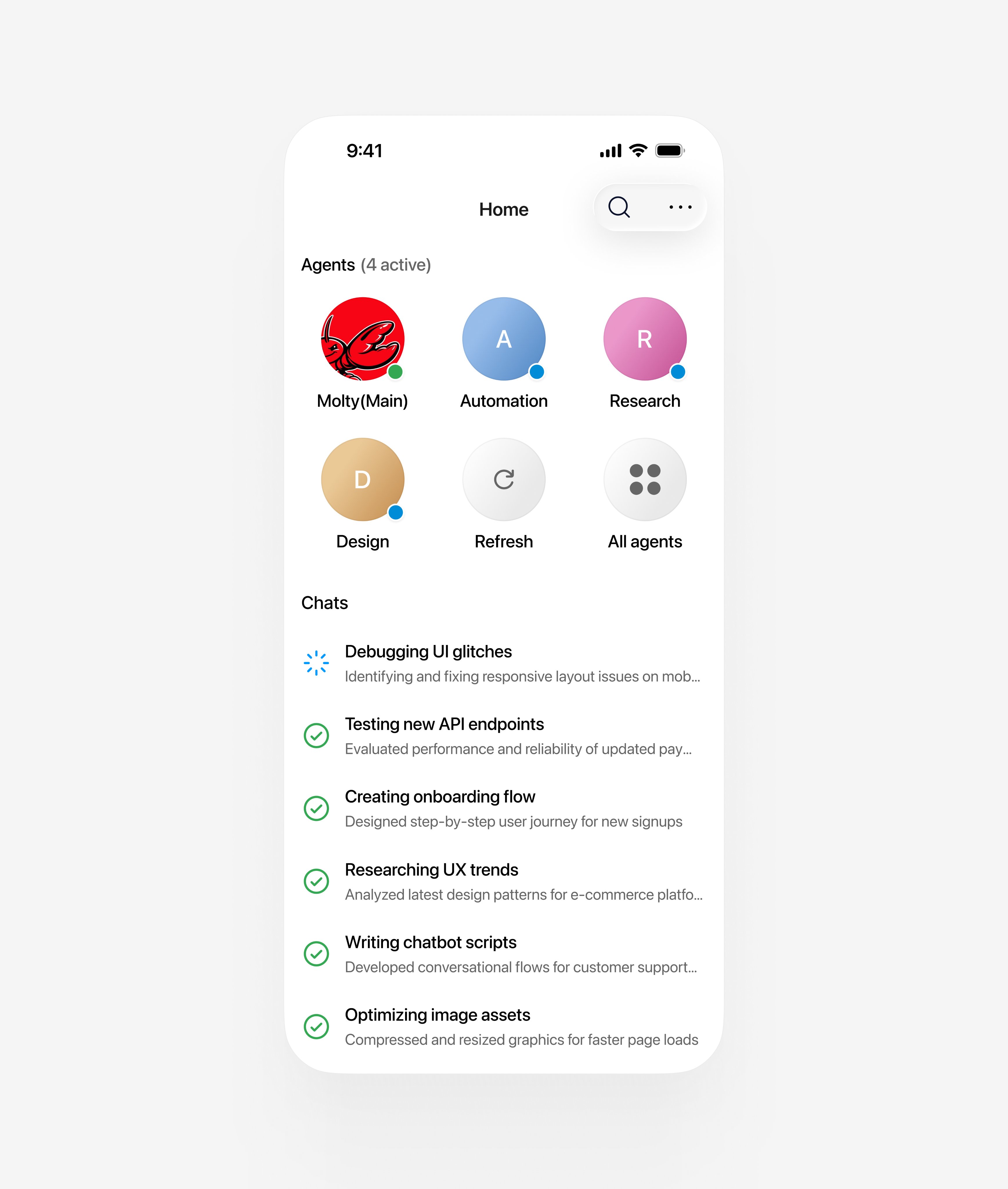
Generic starter numbers for a new app UI. WannaChat's DESIGN.md already goes further: Apple text styles that scale with Dynamic Type, its own tokens (the cheatsheet's raw #000/#666 would break dark mode), 44px buttons. Fixed px sizes and SF Pro would be a step back, since system-ui also has to work on Android.
2026-11-07 · 2026-11-07-Vedantdzn-app-ui-cheatsheet.md · +1 media
Teach Claude a style from real project files and recreate-then-compare rounds, not from finished references; pick the idea yourself. Voice-first and prototype-before-build are already in the studio bar. The Vox look itself doesn't fit the Reels bar, and the post ends by pitching her paid skill. Saved for later: use this method if John ever wants an actual short movie scene (layered 2.5D shots, voice first, storyboard review, since long renders are where a storyboard pays off).
2026-11-04 · 2026-11-04-naometzger-claude-vox-editing.md